


All entries
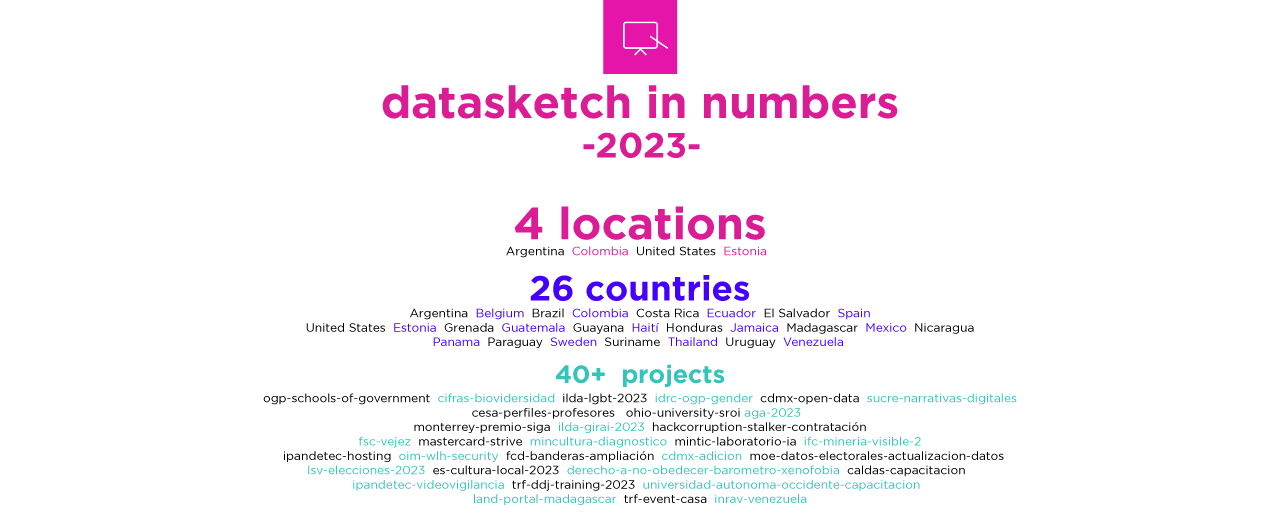
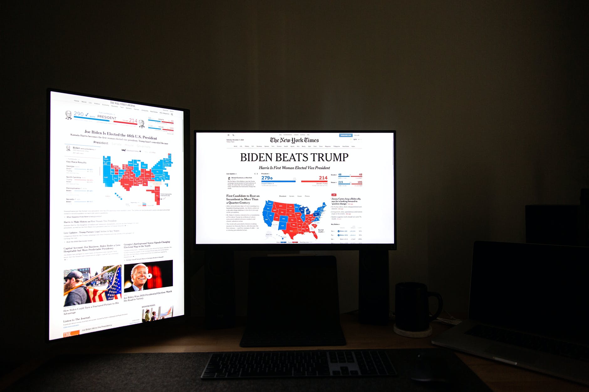
2023 in Numbers - Datasketch Newsletter #42
Data Science | Product | Artificial Intelligence
Advocacy against Violence - Datasketch Newsletter #41
Women | Internet | Rights
Eye on Privacy - Datasketch Newsletter #40
Central America | Video surveillance | Privacy
Technology Solutions in Action - Datasketch Newsletter #39
ABRELATAM | Open Data | CKAN
Accessibility and Visualizations for Social Change - Datasketch Newsletter #38
Visualizations | Artificial Intelligence | Public Procurement
Inform yourself before choosing - Datasketch Newsletter #37
Media | Public Procurement | Elections
Evidence to Propel Journalism - Datasketch Newsletter #36
Investigative Journalism | Civic Technology | Press Freedom
Next stop: OGP Global Summit - Datasketch Newsletter #35
OGP | Action Plan | Inclusion
Rights in Motion - Datasketch Newsletter #34
Migration | Human Rights | Xenophobia
The Economic Outlook - Datasketch Newsletter #33
Economy | Sustainability | Aging
AI Perspectives - Datasketch Newsletter #32
Artificial Intelligence | Work | Journalism
The Horizon of Accessible Information - Datasketch Newsletter #31
Video Surveillance | Older People | CSOs
Diversity as Seen from the Evidence Datasketch Newsletter #30
Diversity | LGBTIQ+ | Latin America and the Caribbean
Proud of These Projects - Datasketch Newsletter #29
Rights | LGBTIQ+ | Americas
Data for Cities - Datasketch Newsletter #28
Cities | Trees | Technology
Pandemic goes, inequalities remain - Datasketch Newsletter #27
COVID-19 | Contracts | Corruption
Carrasco: "To talk about data protection is also to talk about redistribution"
Carlos addresses the challenges of data use in municipalities.
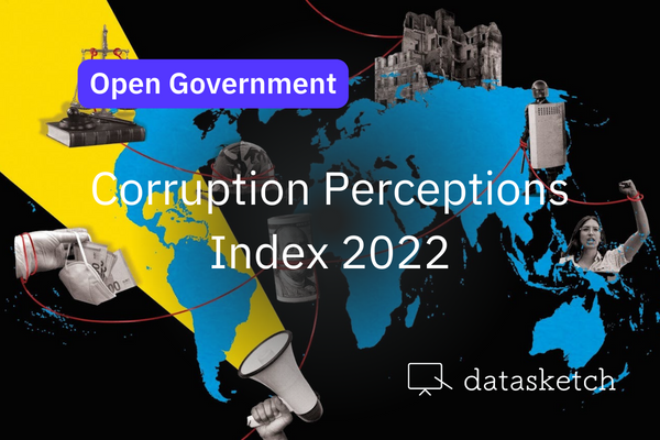
The Americas in the Corruption Perceptions Index
We have reviewed the results for the countries of the Americas. Now we tell you how we see the …
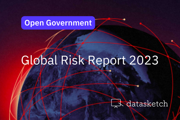
WEF - Global Risks Report 2023
The World Economic Forum published last week the Global Risks Report 2023. Here are the main …
Huge data requires simple explanations
Story telling | New Perspectives in Communication | Big Data
A Review of 2022
Projects | End of the year
Toward an Open Americas
América Abierta is a regional meeting of diverse communities that seeks to connect actors to work …
There is a future if there is truth
We dedicate a special issue of our newsletters to the final report of the Truth Commission because …

Datos y Guaros: Colombia and the 2022 Pandemic Elections
See the projects presented in the latest edition of our Data and Guaros.
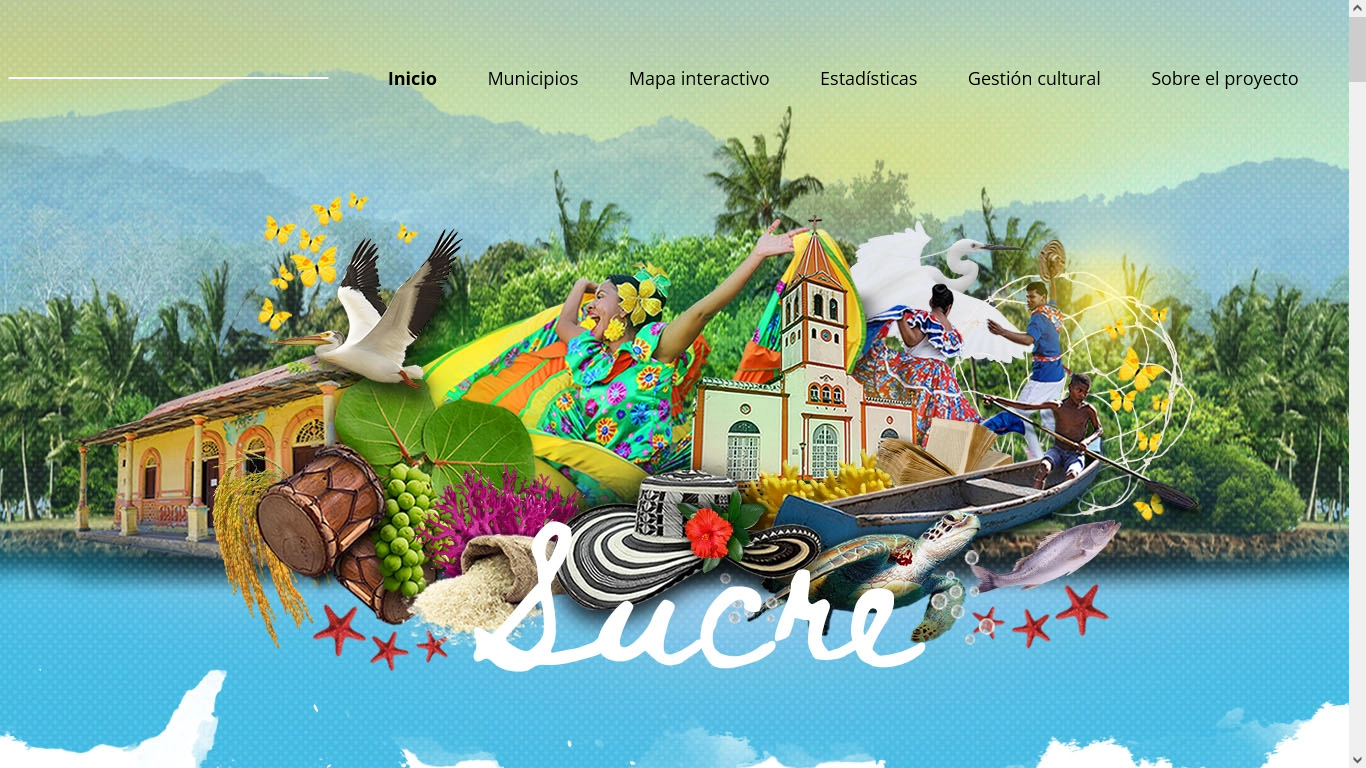
Sucre Cultural Map: A Project with the Datasketch Label
Sucre Information System and Cultural Map had its premiere on May 13. Datasketch worked on data …
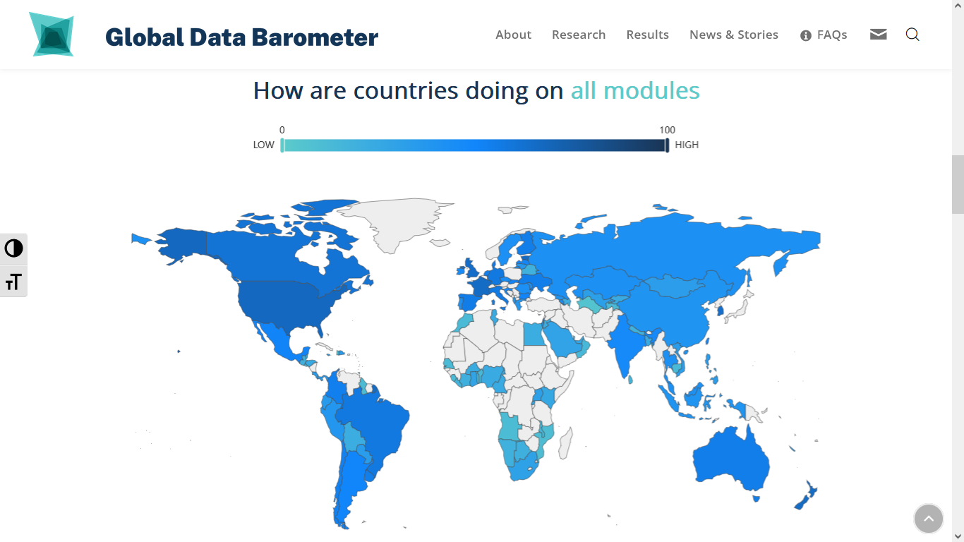
The First Edition of the Global Data Barometer Is Now Available
The first edition of the Global Data Barometer took place on May 11, and Datasketch participated in …
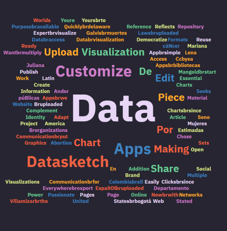
Text Visualization: Word Clouds
Data visualization is usually related to graphical representations of numbers, but when the …

#AccesoALaInformacionYa
Access to public information is a fundamental right for citizens to build better relationships with …

Data Culture and Datasketch
Our approach to data culture encompasses open data, algorithmic art, textile art with data, …
Open Data Day: Futurology and Prospecting
Did you miss Cami Bohórquez's talk as part of the Spinning Futures 2050 project? Don't worry, we …
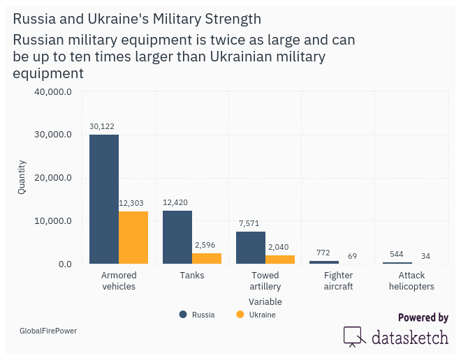
Russia and Ukraine's Military Strength: Same Data, Different Visualizations
The military strength of Russia and Ukraine can have different visualizations. We consider here the …
The Visualizations of the Tension Between Russia and Ukraine
The media have focused their attention on the tension between Russia and Ukraine. Their graphics and …
Reflections for Democratic Data Governance in Colombia
We reviewed Colombia's draft National Data Infrastructure Plan, collaborating with the Karisma …
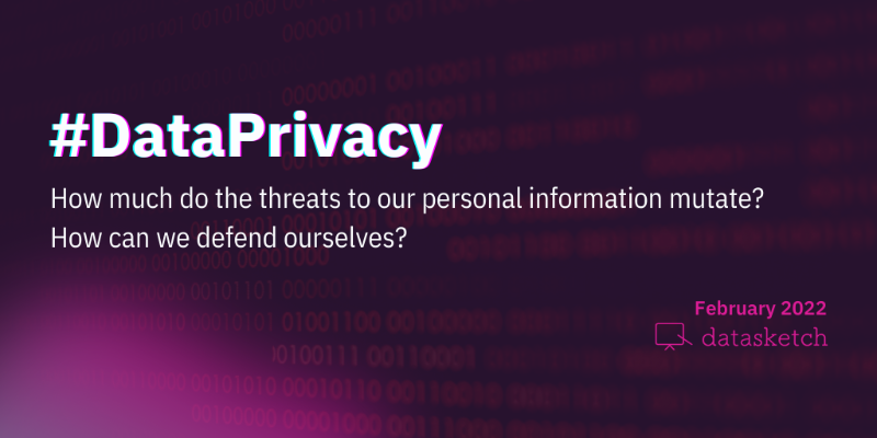
#DataPrivacy
Digital technology promises to speed up processes, but what do we stand to lose when we give up a …
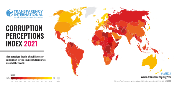
Corruption Perceptions Index 2021
Perceptions of corruption levels worldwide have stagnated over with no significant improvement in …

Numbers in the newsroom
Five tips on numbers and figures that can take your research to another level.
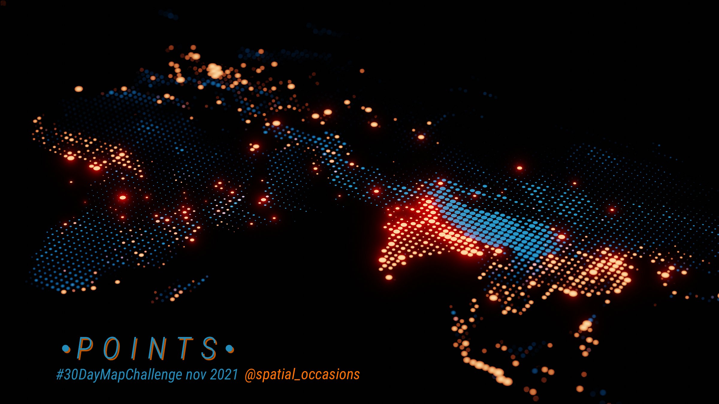
The 30-Day Map Challenge 2021 highlights
In the fifth issue of our Data Journalism newsletter, we announced the #30DayMapChallenge 2021 in …
CILA 2021 - Participatory and Transparent Governments
We cover the panel "Participatory and Transparent Governments,” which kicks off three days of …

Climate Change is a Matter of Social Justice and Human Rights!
Xiomara Acevedo tells us about young journalists' path to confront climate change and strengthen …

Empowering Women to Join the Data Revolution
Speakers from diverse geographies and sectors discuss the critical role of women in the use of data …

Chance, Chaos, and Complexity
Chance, chaos and complexity as approaches to the world.

The limits of a formal programming world
Non-formal programming as a tool for expression, art and culture.
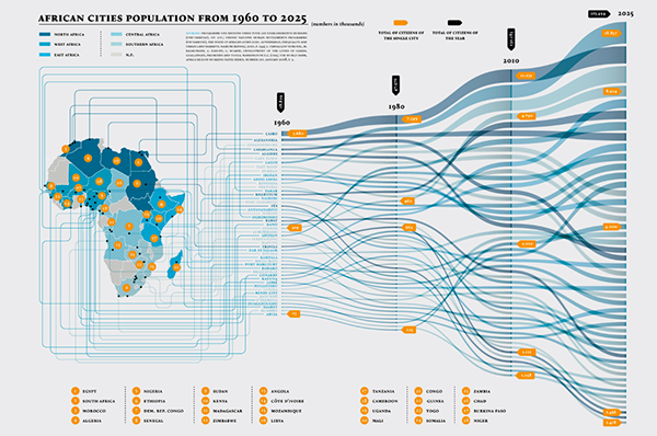
Data Visualization: Alluvial Diagram
An alluvial diagram or alluvial plot is a type of visualization that shows changes in flow over …
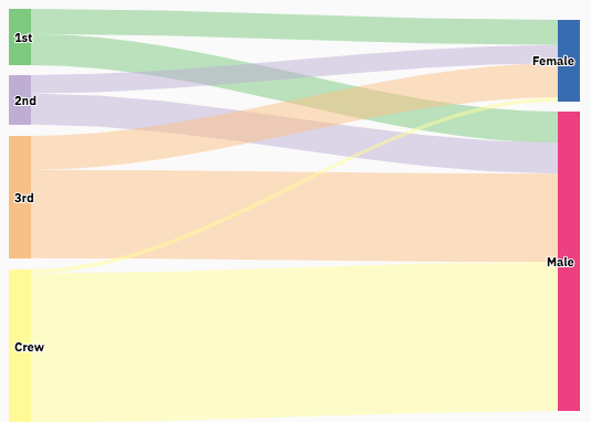
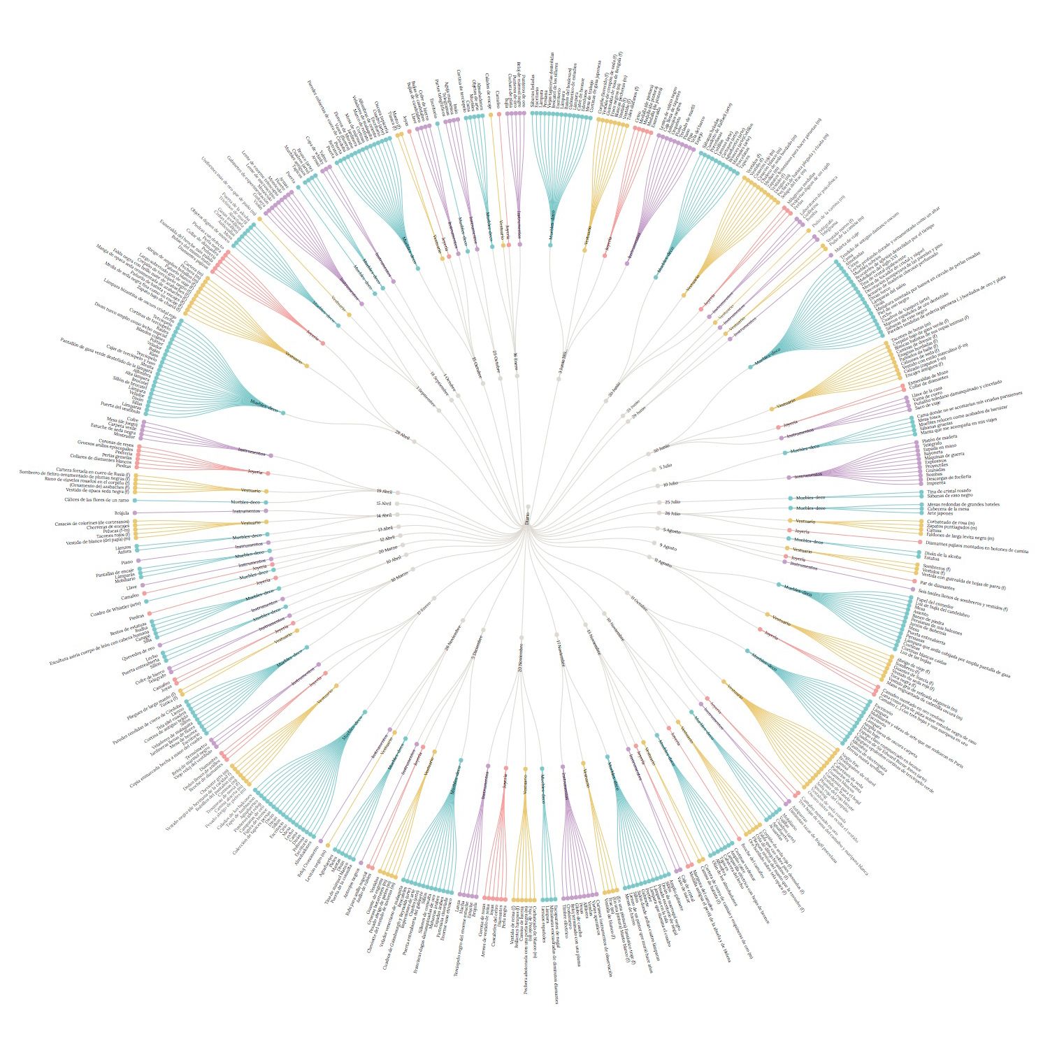
Data visualization: Sankey Diagram
The Sankey diagram is a type of data visualization that allows you to graphically represent the flow …

Copy and paste? The challenges of copyright in the digital world
"Copy and paste" practice, if copyright guidelines are not followed, can become a punishable …
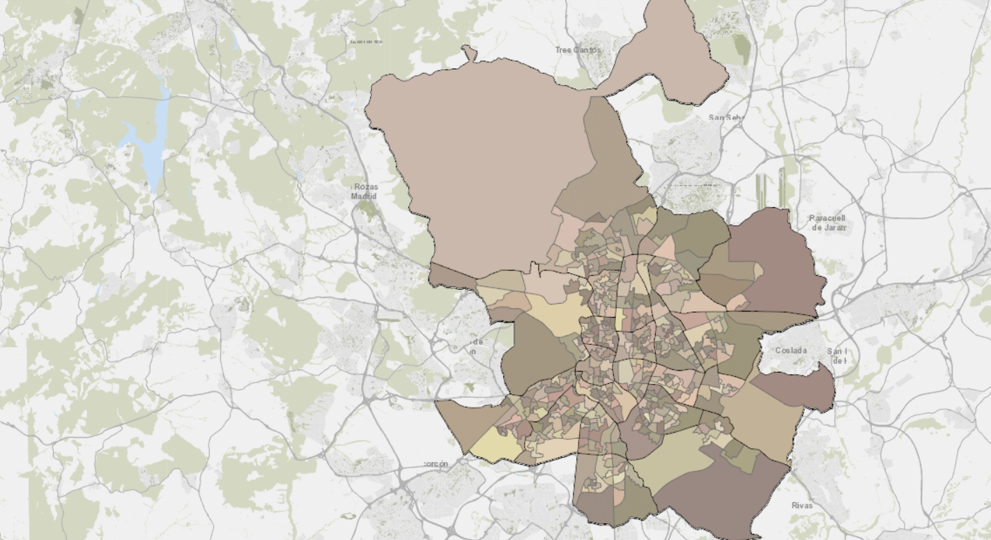
3 Open Data Portals of the Madrid City Council
We review the 3 data portals of the Madrid City Council and show examples of visualization and reuse …
Open Government for Dummies: Open Justice
Open justice is based on the application of the pillars of open government in the judiciary branch. …
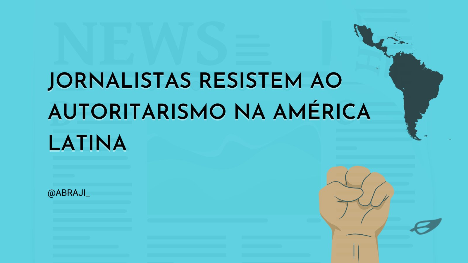
Better Protection for Journalists Is Urgently Needed
Harassment and massive digital attacks on reporters are on the rise but are still not sufficiently …

Attacks on press freedom in Asia
We covered the event "Press in Government's Crosshairs: Persecuted Media in Pakistan and Hong Kong" …
Data Visualization: Treemap
Treemap is a type of data visualization that displays data hierarchically. Here you will find its …

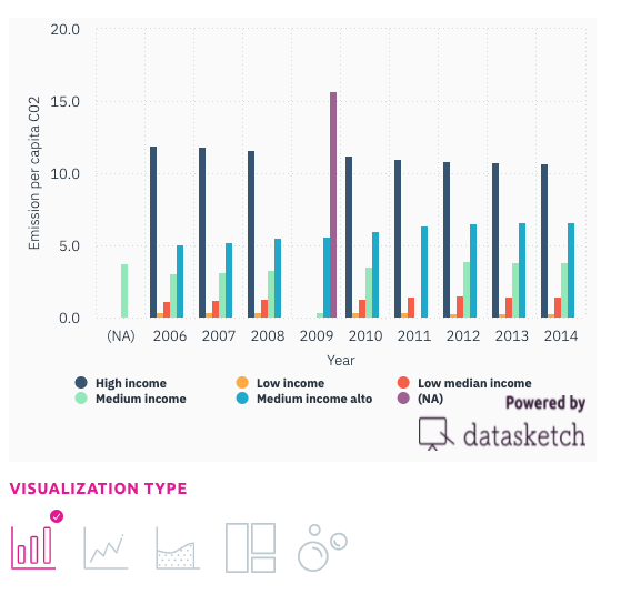
Data Visualization: Bar Chart
We explain to you their characteristics, possible uses, and the different types of bar charts.
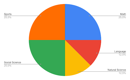
Data Visualization: Pie Chart
The pie chart is a pictorial representation of data that makes it possible to visualize the …
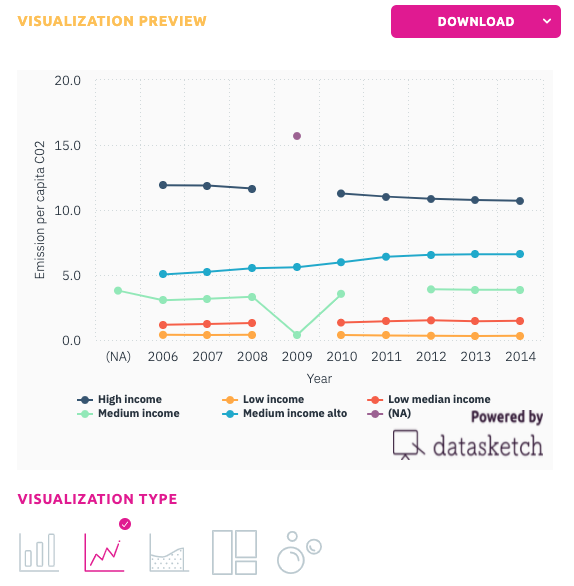
Data Visualization: Line Graph
Learn how to use a line chart and when, its advantages and disadvantages and which of our apps to …

Do Journalists "Hide Behind" Sources When They Use Numbers in the News?
Recommended article. We analyzed the article by Mark Coddinton and Seth Lewis published in NiemanLab …
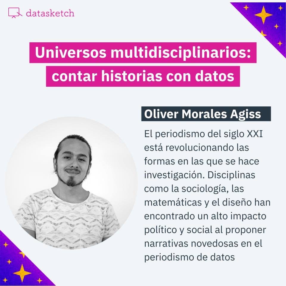
Multidisciplinary universes: telling stories with data
Events at Datasketch House: we discussed about multidisciplinarity with Oliver Morales Agiss.

Root cause analysis: what it is, what it is for and how does it work?
We tell you what root cause analysis is, how and when you can use it.

What is data visualization?
"What numbers cannot communicate in a table becomes visible and intelligible when communicated …
Datasketch Continues on the Open Government Partnership Committee
We celebrate our re-election as members of the Committee of the OGP in Colombia for 2021 - 2023. One …

Datasketch becomes part of Colombia's new Open State Committee
Every two years, Colombia's Open State Committee, Colombia's multi-stakeholder forum for the …

What is data cleaning?
We told you the essential elements to organize and clean your data, the Tidy structure, and why we …
What is the main reason for using data visualization tools?
Why and for what purposes to use data visualization tools.
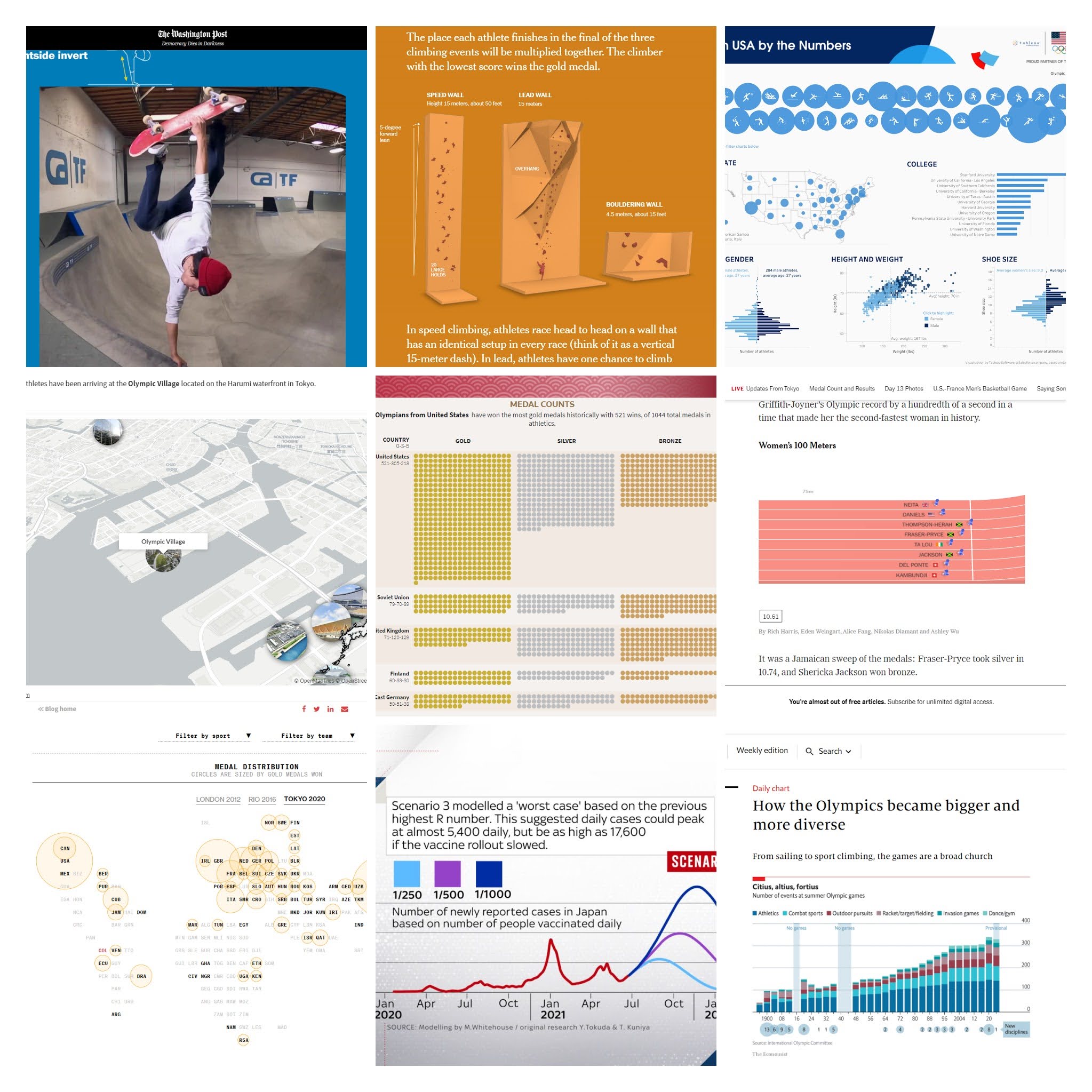
The best visualizations of the Tokyo 2020 Olympic Games
We made a selection of the best visualizations of the Tokyo 2020 Olympic Games. Maps, medal tables, …
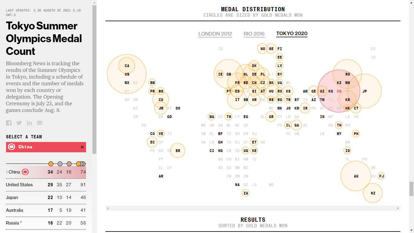
How to visualize the Olympic Games? Bloomberg's example for Tokyo 2020
We analyzed Bloomberg's data journalism special on the Tokyo 2020 Olympics, which features …
What is an infographic?
We explain what an infographic is and how we can communicate data through this graphic tool.

6 Uses of Blockchain in Public Institutions and a Warning Call
We give a brief introduction on what Blockchain is and give examples of how public administrations …

Open government for dummies: Open State
What is Open State and its implications? We examine Open State model that seeks to include the …

Open Government for Dummies: Open Parliament
Open Parliament is based on implementing the pillars of open government in the legislative branch to …

Open Government for Dummies: Accountability
We explain what accountability entails in Open Government and offer examples of good practices.
Open Government for Dummies: Open Data
What is open government data and why it is necessary to achieve Open Government? We review the …

Open Government for Dummies: Participation
Public participation and dialogue improve the relationship between the rulers and the ruled, …
Open Government for Dummies: Transparency
What is transparency in the Open Government model? Transparency and access to public information are …

Open Government: Mapping Initiatives
We are creating a database of Open Government tools. Could you help us?

Open Government in Datasketch
We launched a place to discuss about Open Government. Follow us!

The Triumph of Parity in Colombia: a Historical Debt Owed to Women
Datasketch's House Events: We spoke with Ángela María Robledo, José Daniel López, Adriana Matiz and …

Open Government and Data Journalism
Governments opening up their information is vital. Journalists report data-driven stories based on …

Blockchain: the Future of Cities and Public Sector
Events at Datasketch House: we discussed with Chuy Cepeda, CEO of OS City, the blockchain …

Bitcoin, a Technology for Long-term Financial Saving
A conversation at the Datasketch house with Guillermo Valencia, founding partner of Macrowise, about …
5 tools for transcribing interviews and audios
How long did it take you to transcribe an interview or audio the last time you worked on one of your …

Algorithmic art exhibitions
The Datasketch house and shop is a space that intertwines culture, access to information and data in …
Sobremesa digital: José Asunción Silva's posthumous work data by Clementina Grillo
Datasketch house events: Sobremesa digital with Clementina Grillo
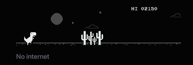
T-REX HI-2150 NO INTERNET
The title of this note refers to three elements that I took from the Google Chrome dinosaur game. …

5 must-read books on data visualization
A selection of books on data visualization and its trends.

Online tools to create your own website
A selection of easy-to-use website-building tools can help you create your website to share your …

Data-driven journalism: Visualizing the lie vs. revealing the truth.
Recommended article. Milagros Salazar defends the idea that a methodology to handle data must be …

"When graphics are a matter of life and death" by Hannah Fry
We summarize Hannah Fry's article published in The New Yorker on how revolutionary graphs and data …

6 Tools for converting files to open and reusable format
Discover 6 tools for converting closed files into open data, which you can use for your stories and …
6 tools to make infographics
We show you a selection of six handy tools to create infographics.

How is an algorithmic bias composed?
Algorithms and codes developed by humans get as much or more wrong than we do, but how do they work?

How to do fact-checking journalism?
The task of fact-checking is demanding and in the face of the era of disinformation and fake news, …

Privacy is Power: Why and How You Should Take Back Control of Your Data
Review. This book written by Carissa Véliz raises awareness about the dangers of the new data …
Bring data to life
The job of a data journalist is to find stories in the data and in the numbers. What matters is not …
5 tools for creating interactive maps
If you need to create a map, you should check this tools.

6 films to learn about journalism
Here are six films that talk about journalism, question it, criticize it and give some food for …

Deep fake and other threats against the truth
Do you know what a deep fake is? This technology, which can be fun, carries some risks that we will …

Machines vs. Humans: Is technology the answer to everything?
We review the opinions of journalists and authors on this question.

Protect your data by protecting your passwords
We show you how to create and manage secure passwords to protect your projects.

Storytelling with Data
We look at author Cole Nussbaumer Knaflic's recommendations for creating good stories with data.

The 4 Google Earth features nobody told you about
All journalists must respond to the 5W, better known as the what, who, where, when, and why. Google …

Open Gov: Civic Participation in Taiwan
Despite not being recognized as an official OGP plan, Taiwan maintains world recognition in Open …
How I got 10.000 emails for launching our newsletter
Tips and tricks to grow your email list from people you already know. Datapreneur.
Training in Data Science for Public Officials in Madrid
Introduction to the elements of data science for public servants: open data, visualization and …

21 Recommendations for Open Vaccination
Information about vaccine purchases and distribution is not open yet. We review the Open Government …
More charts more readers: coronavirus visual stories
How two international publications used charts, graphics and data visualization to reach a wider …

Open Government for Dummies: Why Is an Open Government Important?
What is open government, why it is important and how data visualization can help.