


Data Journalism
Huge data requires simple explanations
Story telling | New Perspectives in Communication | Big Data

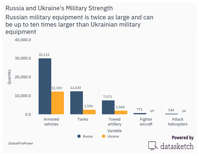
Russia and Ukraine's Military Strength: Same Data, Different Visualizations
The military strength of Russia and Ukraine can have different visualizations. We consider here the …
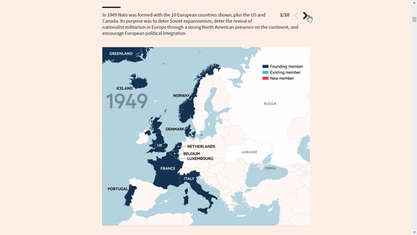
The Visualizations of the Tension Between Russia and Ukraine
The media have focused their attention on the tension between Russia and Ukraine. Their graphics and …

Numbers in the newsroom
Five tips on numbers and figures that can take your research to another level.
The 30-Day Map Challenge 2021 highlights
In the fifth issue of our Data Journalism newsletter, we announced the #30DayMapChallenge 2021 in …

Empowering Women to Join the Data Revolution
Speakers from diverse geographies and sectors discuss the critical role of women in the use of data …
Better Protection for Journalists Is Urgently Needed
Harassment and massive digital attacks on reporters are on the rise but are still not sufficiently …

Attacks on press freedom in Asia
We covered the event "Press in Government's Crosshairs: Persecuted Media in Pakistan and Hong Kong" …

Do Journalists "Hide Behind" Sources When They Use Numbers in the News?
Recommended article. We analyzed the article by Mark Coddinton and Seth Lewis published in NiemanLab …

Root cause analysis: what it is, what it is for and how does it work?
We tell you what root cause analysis is, how and when you can use it.

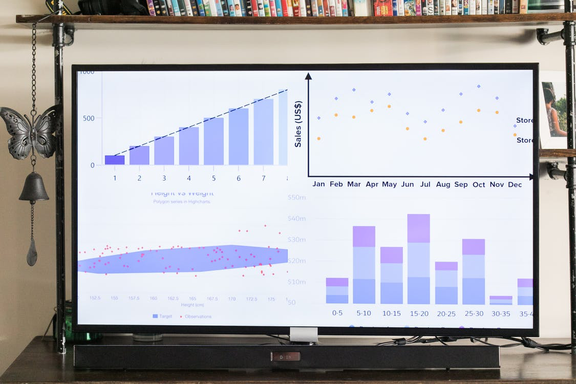
What is data visualization?
"What numbers cannot communicate in a table becomes visible and intelligible when communicated …

What is data cleaning?
We told you the essential elements to organize and clean your data, the Tidy structure, and why we …
What is the main reason for using data visualization tools?
Why and for what purposes to use data visualization tools.
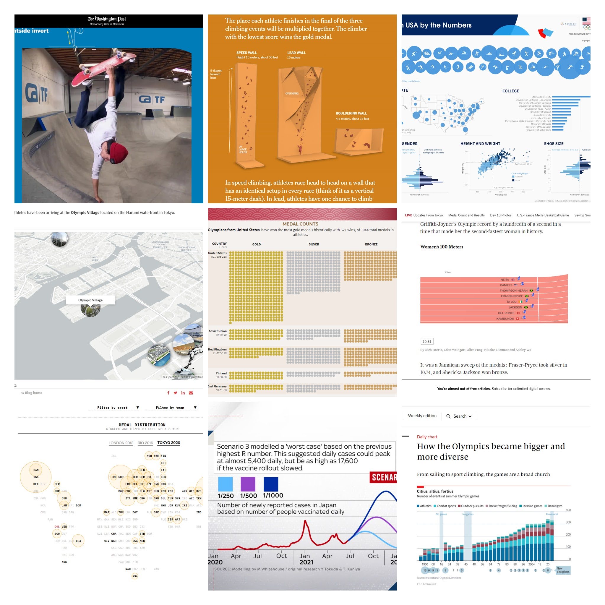
The best visualizations of the Tokyo 2020 Olympic Games
We made a selection of the best visualizations of the Tokyo 2020 Olympic Games. Maps, medal tables, …
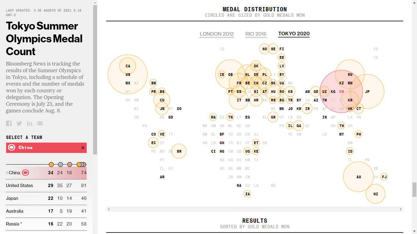
How to visualize the Olympic Games? Bloomberg's example for Tokyo 2020
We analyzed Bloomberg's data journalism special on the Tokyo 2020 Olympics, which features …
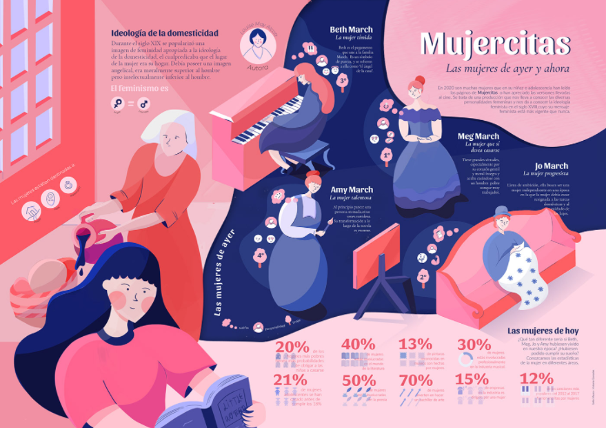
What is an infographic?
We explain what an infographic is and how we can communicate data through this graphic tool.
5 tools for transcribing interviews and audios
How long did it take you to transcribe an interview or audio the last time you worked on one of your …

5 must-read books on data visualization
A selection of books on data visualization and its trends.

Online tools to create your own website
A selection of easy-to-use website-building tools can help you create your website to share your …
Data-driven journalism: Visualizing the lie vs. revealing the truth.
Recommended article. Milagros Salazar defends the idea that a methodology to handle data must be …
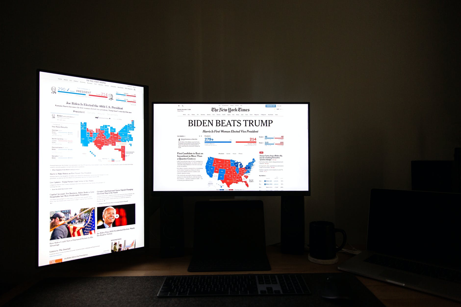
"When graphics are a matter of life and death" by Hannah Fry
We summarize Hannah Fry's article published in The New Yorker on how revolutionary graphs and data …

6 Tools for converting files to open and reusable format
Discover 6 tools for converting closed files into open data, which you can use for your stories and …
6 tools to make infographics
We show you a selection of six handy tools to create infographics.

How is an algorithmic bias composed?
Algorithms and codes developed by humans get as much or more wrong than we do, but how do they work?

How to do fact-checking journalism?
The task of fact-checking is demanding and in the face of the era of disinformation and fake news, …

Privacy is Power: Why and How You Should Take Back Control of Your Data
Review. This book written by Carissa Véliz raises awareness about the dangers of the new data …
Bring data to life
The job of a data journalist is to find stories in the data and in the numbers. What matters is not …
5 tools for creating interactive maps
If you need to create a map, you should check this tools.

6 films to learn about journalism
Here are six films that talk about journalism, question it, criticize it and give some food for …

Deep fake and other threats against the truth
Do you know what a deep fake is? This technology, which can be fun, carries some risks that we will …

Machines vs. Humans: Is technology the answer to everything?
We review the opinions of journalists and authors on this question.

Protect your data by protecting your passwords
We show you how to create and manage secure passwords to protect your projects.
Storytelling with Data
We look at author Cole Nussbaumer Knaflic's recommendations for creating good stories with data.

The 4 Google Earth features nobody told you about
All journalists must respond to the 5W, better known as the what, who, where, when, and why. Google …
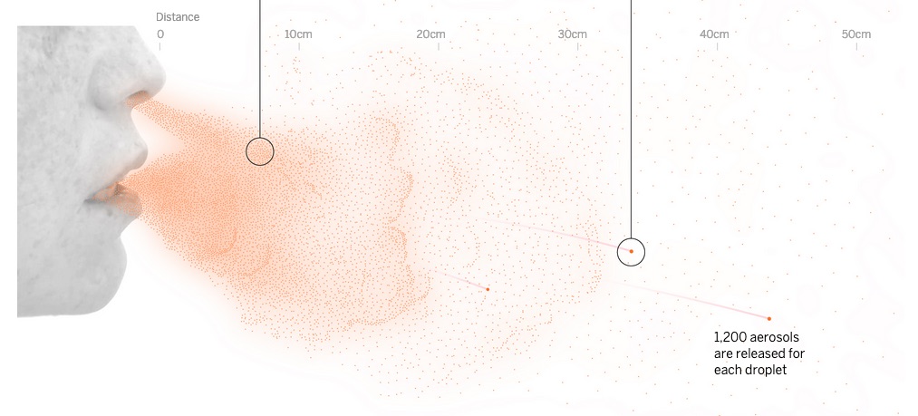
More charts more readers: coronavirus visual stories
How two international publications used charts, graphics and data visualization to reach a wider …