


Huge data requires simple explanations
Story telling | New Perspectives in Communication | Big Data
Available in:

By Laura Tamia Ortiz Chaves
Talking about huge data and amounts in articles, news, social networks, and reports is a trend that has been on the rise for years, even centuries. In the Middle Ages, there was already a system to count up to 9,999 just with your fingers. If we can count it, we want the rest to know: I have 50,000 new followers on Twitter. WOW!
There is a problem. Our brains don’t fully understand such large numbers. In 2017, several articles, such as this one, written by Jo Craven McGinty for the Wall Street Journal, pointed out that big numbers baffle us, and this compromises our ability to judge information as relevant as economic information, budgets, or scientific findings.
This problem is intensified when many gigantic numbers are presented together, accompanied by graphs without context. Okay, that’s the problem, but …
What can you do to make big numbers more meaningful?
Pablo J. Barrio, Daniel G. Goldstein, and Jake Hofman researched and published on this topic. Many years have passed, but their proposal continues to be interesting, Big Data is the order of the day, and giant quantities continue to appear everywhere.
The researchers concluded that we should change how we say things and the way we approach saying things. They proposed the simple technique of creating simple sentences that relate big numbers to familiar topics, or as they call it, “putting the data in perspective”.
Talking about 300 million registered guns in the United States is not the same as quoting the same number and adding: which equates to approximately one firearm per person in the country. In the second case, the chances of understanding and remembering the figure increase.
Their article presented a table of formulas for developing these kinds of phrases or new perspectives on communicating data. It is still completely valid. The important thing is not to work with data. It is vital that they reach the right people and are easily understood. The study also discusses other mechanisms that can help us understand and remember data, such as repetition or contextual information.
Here are some examples:
Let’s have a look at the table and some examples of transforming these structures into understandable sentences:
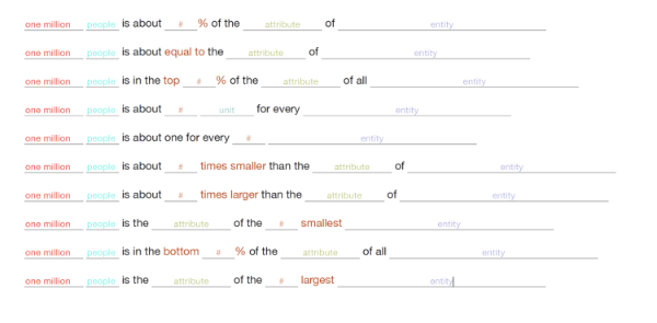
Source: screenshot of the table presented in the article.
- 3,390,000 people, or approximately 50% of the population of Bogota.
- The concert had 60,000 spectators or, in other words, as many people as can fit in Tokyo’s Olympic stadium.
- 31.5% of Spanish households “do not have a budget that guarantees decent living conditions”. That is, approximately 3 out of 10 families.
- An estimated 500,000 people in Spain suffer from symptoms compatible with a temporary prolongation of Covid. Approximately 1 in 10 people who have passed the coronavirus suffers from persistent Covid.
- The discovered planet, Centauri b, is 10 times more massive than Jupiter, making it one of the most massive planets ever found.
- According to NOAA’s U.S. National Centers for Environmental Information, this year is likely to finish in the top 10 warmest years since 1880 (in 142 years).
- 52.5 million euros is the wealth of Amancio Ortega, the person with the largest fortune in Spain.
- The storm left one million people homeless, which is 12% of the population of Honduras.
It’s simple, isn’t it? It’s also useful. Most of the examples are taken from real news stories.
Use this technique in your next reports and news releases. Your readers will appreciate it.