Russia and Ukraine's Military Strength: Same Data, Different Visualizations
The military strength of Russia and Ukraine can have different visualizations. We consider here the scope and limitations of some of them when displaying data.
Available in:
By Juan Pablo Garnica Munévar. February 25, 2022.
In the visualizations of the tension between Russia and Ukraine, we found that certain media showed differently the data comparing the military power between Russia and Ukraine. This was the case of Financial Times, Reuters, and BBC. We evaluate the graphics of these media, along with the original proposal of the data source and a visualization of our own.
The data came from GlobalFirepower’s (GFP) Military Strength Comparisons 2022 and the International Institute for Strategic Affairs' (IISS) Military Balance 2022. In comparison to IISS, GFP has charts and numbers available, which we will evaluate below.

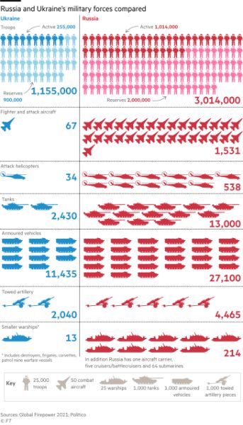
Pictorial chart comparing the Armed Forces of Russia and Ukraine. Source: How serious is Vladimir Putin about launching a major Ukraine offensive?
Financial Times made a pictorial graphic, which is visually appealing. It makes an impact with the proportions of the elements they compare. Since they could not make icons for each unit, they opted for scales (a certain number for each icon). However, with units, the contrast can be even bigger. That is why they rely on the number of each item to help with the comparison.
Reuters Graphics stacked bars

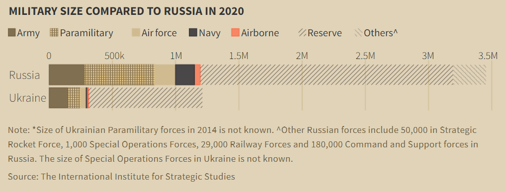
Stacked bar chart of Russia and Ukraine’s military size in 2020. Source: Mapping Ukraine and Russia on the edge of war.
Reuters Graphics proposed a stacked bar chart by country. With this type of chart, the difference between each country can be more noticeable. Russia doubles Ukraine in military units. However, the exact numbers may be missing, i.e., the detail. This chart gives an overview, so it is useful for estimating, but it is not as effective for knowing the values by each category.
The BBC comparison table

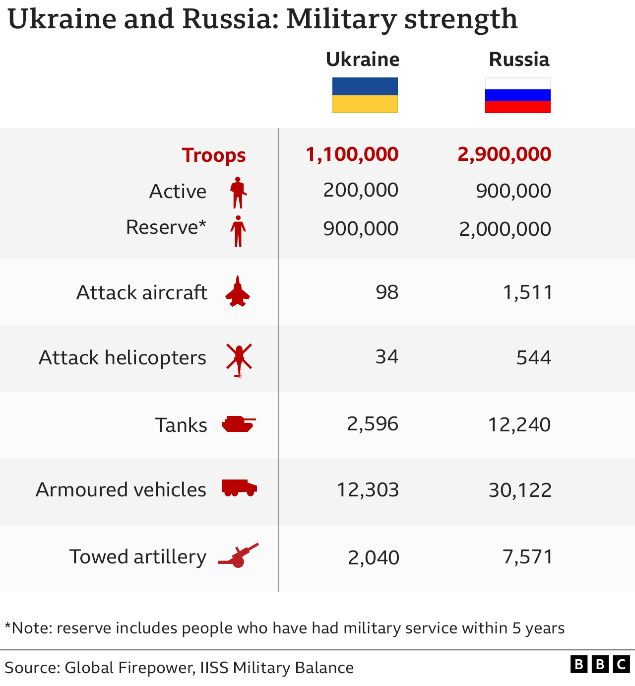
Comparative table of Ukrainian and Russian artillery. Source: Is Russia going to invade Ukraine and what does Putin want?
BBC used a table that provides the numbers for each party. This chart may be more concrete, but it is not very visual and therefore less attractive. To make up for this shortcoming, they add the flags of the countries and the icons of the elements compared. Unlike the previous charts, this table may be more functional, but it may miss the aesthetic impression.
At the time of writing, the chart was no longer available in the BBC reports we covered in the post on visualizations of Russia-Ukraine tension. To retrieve it, we looked for the web page screenshots available from the Internet Archive’s Wayback Machine.
GlobalFirepower Stacked Bars

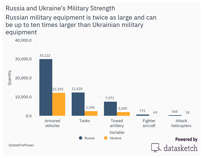
Stacked bars according to GlobalFirepower criteria. Source: Comparison of Ukraine and Russia Military Strengths (2022)
The source data page of the visualizations also has its own version. GlobalFirepower uses stacked bars that account for the proportions of both countries according to each aspect, such as active personnel. These bars show which country is better in each aspect evaluated, as a bid. In addition, it identifies the percentages of the values, the differences between countries, and their position in the global ranking. However, the advantage of the media visualizations is that they compare the elements as a whole, which gives an overview.


