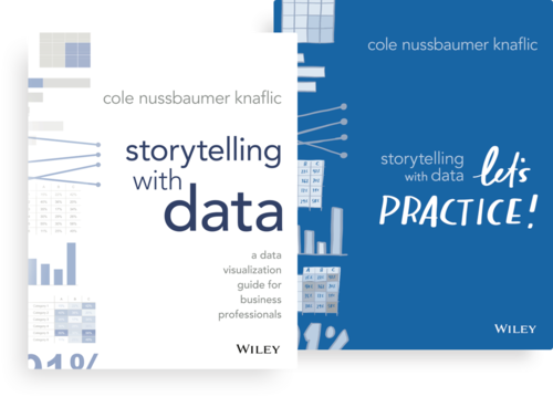
Storytelling with Data
We look at author Cole Nussbaumer Knaflic's recommendations for creating good stories with data.
Available in:

Data, mainly numerical data, can be complex for readers. An excellent way to ground data in the real world and make it more understandable is storytelling. The art of telling a story in a way that allows recipients to internalize, understand, and create personal meaning of it.
The foreword to Storytelling with Data: A data visualization guide for business professionals by Cole Nussbaumer Knaflic, mentions that having all the information in the world at your fingertips does not make communication more accessible: it makes it more challenging. The more information you are dealing with, the harder it is to filter out the most significant bits.
The book discusses that telling stories with data is a skill that is becoming increasingly important in our data-rich world. Effective data visualization can mean the difference between success and failure when communicating the results of a study or simply getting your point across to your audience.
Journalists should keep the following recommendations from Nussbaumer’s guide in mind when telling a story because data should lead us to discover something to know at the end of the day.

1. Understand the context
It is important to have context. You should think about who you are communicating to and how your audience perceives you. It can help you identify what language to use, what tone to use, what you need your audience to know about this story.
Storyboarding - a visual script of the content you plan to create - is perhaps the most important thing you can do to make sure your communication is on point, as it establishes a structure and steps to follow. You can use Shotbox, Storyboard Generator, or Storyboard That.
2. Choose the right visualization
Context is everything and will help you choose the right way to display your data.
The first step is to consider what kind of data you have: If you have few numbers, you may not need a chart. Sometimes a simple sentence is enough and much clearer.
The guide dictates that “when there is just a number or two you want to communicate: use numbers directly.” When there is more data to show, usually a table or graph is the way to go. One thing you need to understand is that people interact differently with these two types of images. There is no one right visualization; instead, there are often different types of images that might meet a given need.
We recommend this article on how to visualize better COVID-19 data: Tips for visualizing COVID-19 data.
3. Eliminate clutter
Nussbaumer mentions cognitive load as the mental effort required to learn new information. It’s what we do with the data we provide to an audience.
If we have a large amount of data and don’t communicate it in an organized way, the audience will not understand what we want them to understand. “Human brains have a finite amount of this mental processing power.” So as information designers, we have to be smart about how we use our audience’s brainpower.
We need to avoid processing that sucks up mental resources but doesn’t help the audience understand the information. Also, if there is clutter, the story may seem more complicated than it is.
4. Focus attention to where you want it
Here you need to think about how your audience observes and perceives the information. Again, design and visual tools can create a visual hierarchy of elements to guide your audience through the information you want to communicate in the way you want them to process it.
One thing to keep in mind is that people tend to associate quantitative values with some (but not all) of the pre-attentive attributes, which are the ones that allow you to direct attention to one element or another. So, for example, most people will consider a long line to represent a higher value than a short line. That’s one of the reasons why bar charts are easy to read.
It is essential because it tells us which of the attributes can be used to encode quantitative information and which should be used as categorical differentiators (line length, spatial position, or to a more limited degree, line width, size, and intensity can be used to reflect relative value).
5. Think like a designer
When it comes to the form and function of our data visualizations, we first want to think about what we want our audience to do with the data (function) and then create a visualization (form) that enables this with ease.
You must be thinking: But I’m not a designer. “Stop thinking this way,” the book says. You can recognize intelligent design. By familiarizing ourselves with some everyday aspects and examples of great design, we instill confidence in visual instincts and learn some practical tips to follow and adjustments to make when things don’t feel right. For example, highlight what’s important, eliminate distractions, create a clear visual hierarchy, use highly accessible design tools, and share it with others before you post so they can give you feedback and comment on whether or not it’s clear on the message.
You can access Cole Nussbaumer Knaflic’s complete guide at this link.
¡Now you can tell a story!
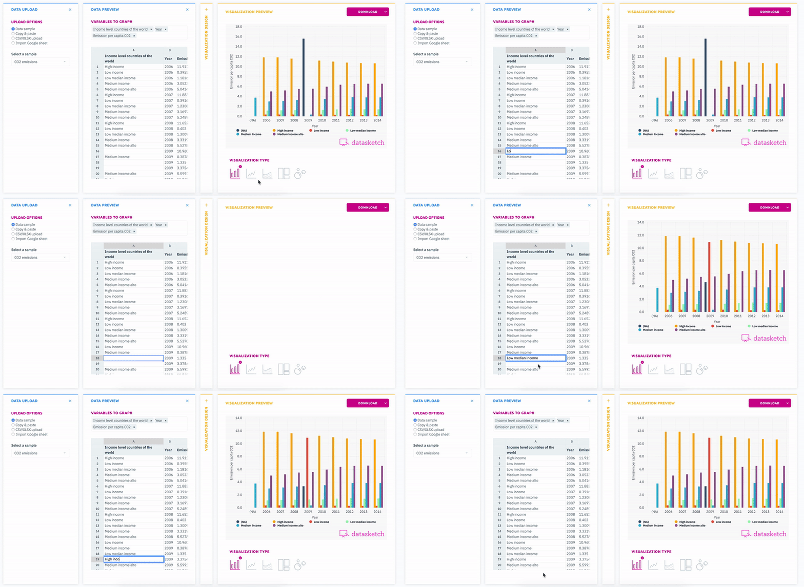
Here at Datasketch we have multiple tools at your disposal that could help you tell your story. Try them out!


