The best visualizations of the Tokyo 2020 Olympic Games
We made a selection of the best visualizations of the Tokyo 2020 Olympic Games. Maps, medal tables, multimedia specials, and comparatives.
Available in:
By Juan Pablo Garnica Munévar. Published: August 07, 2021.
The Olympic Games are an excellent occasion to find creative and innovative visualizations of Olympic data, ranging from medals, certain sports, to the Olympic Games themselves.
Reuters Graphics
Reuters Graphics developed a special that consists of maps, renderings, and graphics on the Olympic venues, torch relay, and temperature comparisons between editions. Its medal tally is a stacked bar chart with the medal colors. The Explainers section presents detailed descriptions and illustrations by sport, including their historical data, and dot plots of winners with the most medals and all the awards by country.
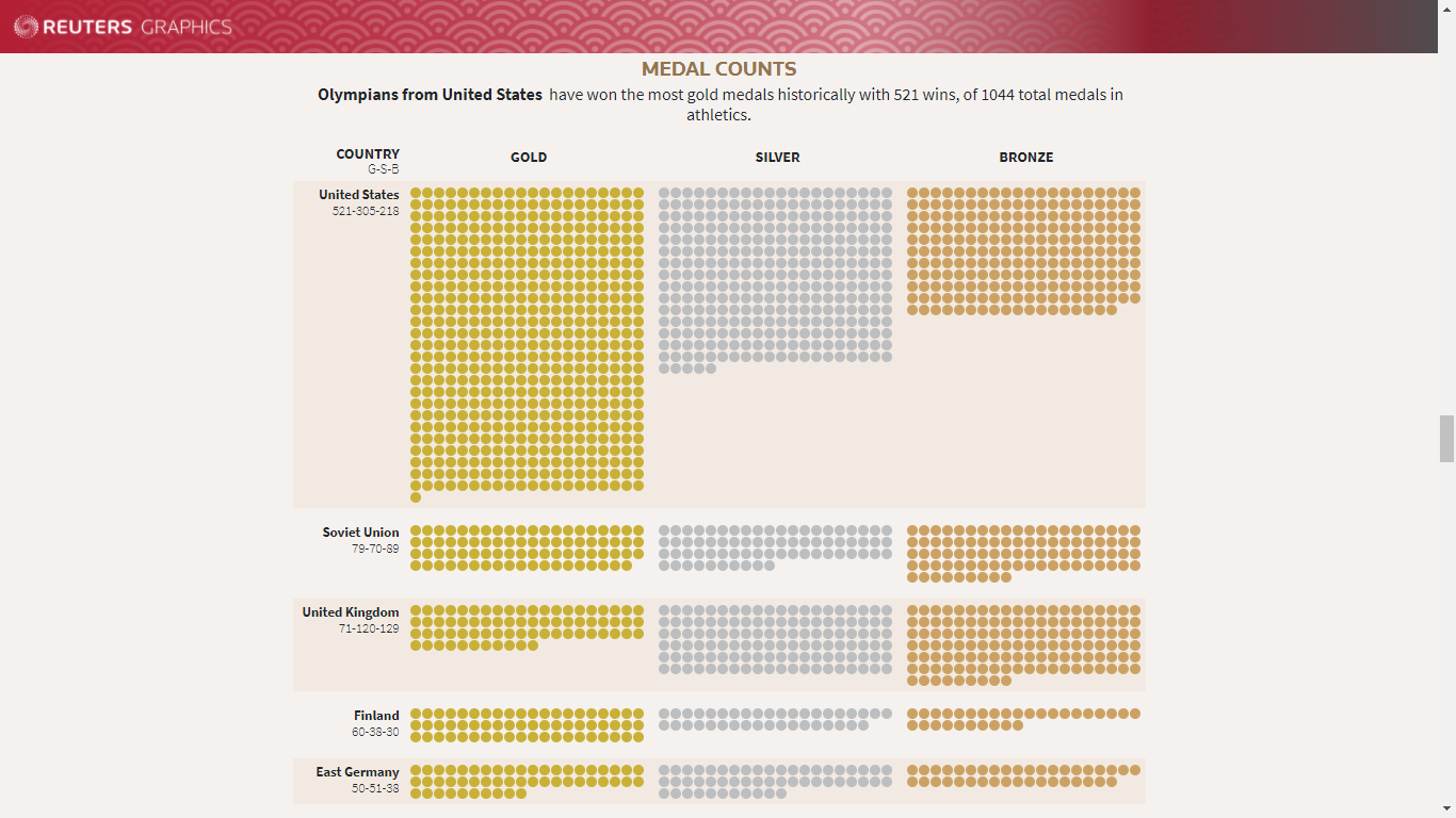
Dot plot of the countries with the most medals in athletics. Source: https://graphics.reuters.com/OLYMPICS-2020/EXPLAINER/gjnvwnlwgpw/index.html
Bloomberg
Bloomberg launched a special with area difference charts to show the predominant countries in each sport, as well as golden bubble charts arranged on a map and a table with historical comparison of results. These visualizations excel at showing historical data, which goes back to 1896. We cover the Bloomberg special in this post.
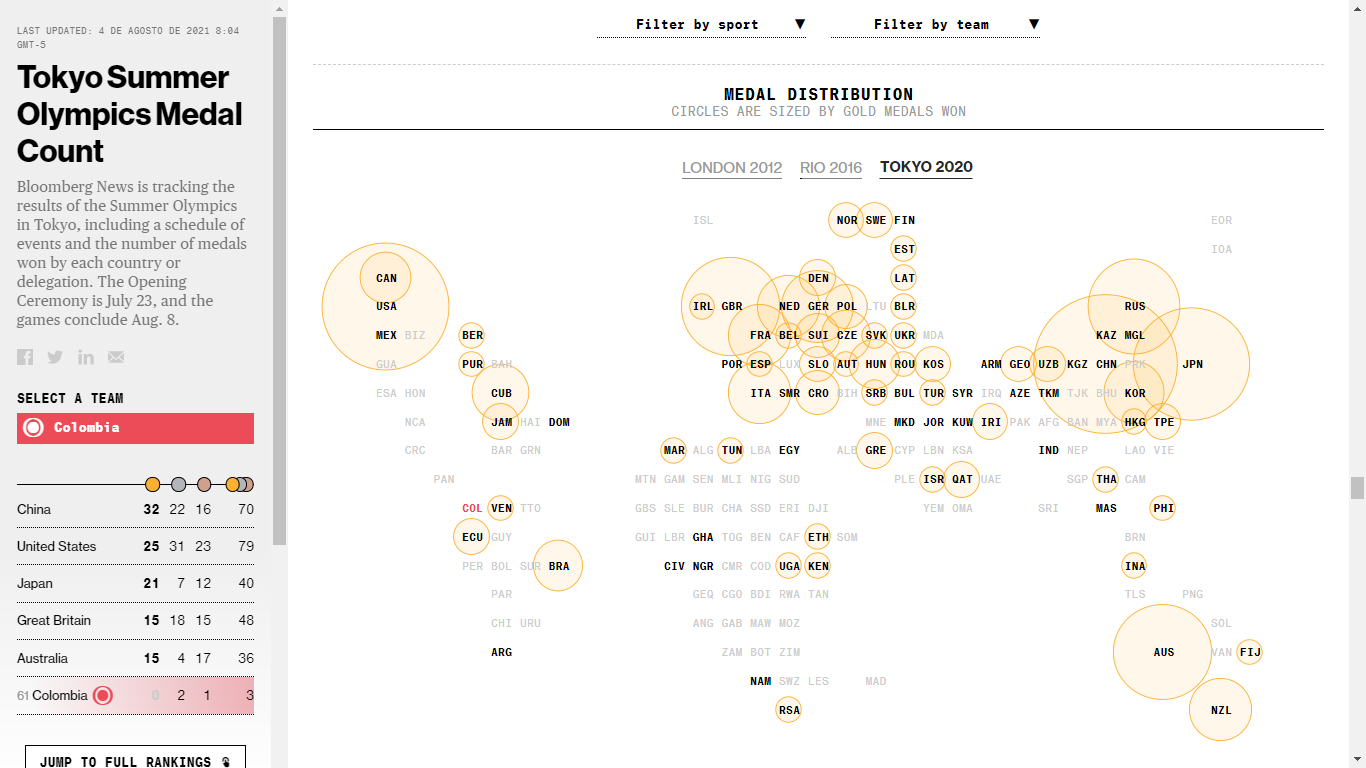
Bubble map of the distribution of gold medals won at Tokyo 2020. Source: https://www.bloomberg.com/graphics/tokyo-2020-summer-olympics-medal-count/
The New York Times
The New York Times has published several publications that specialize in a particular competition, usually in sports in which the United States leads or those that attract the most public attention at the Olympics, such as athletics and swimming. Through visualizations, they analyze how a certain athlete won or broke an Olympic or world record.
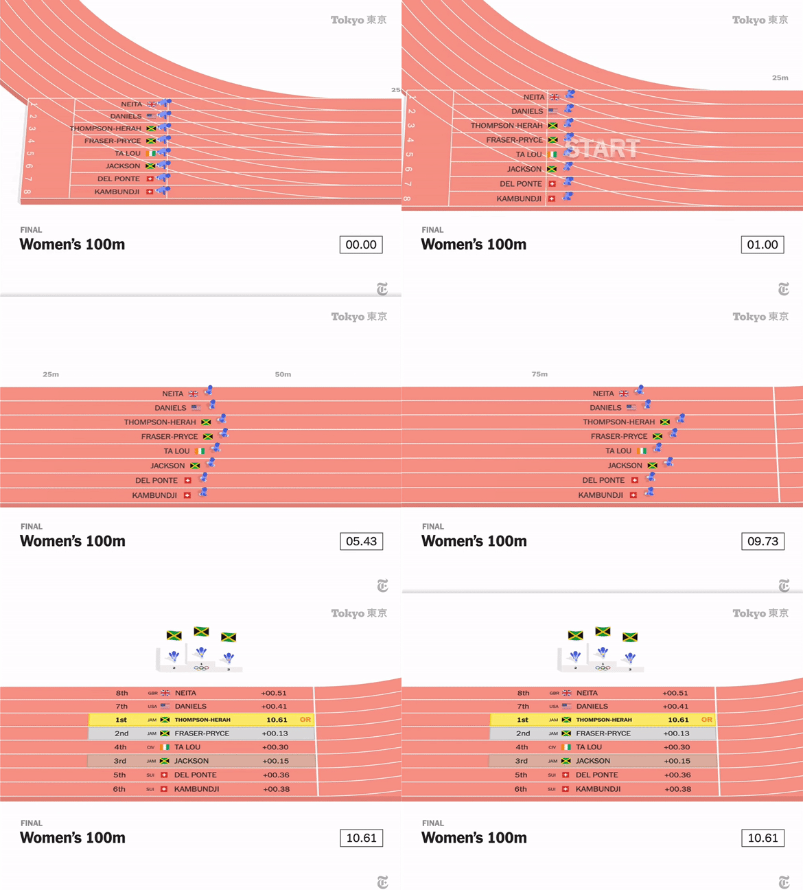
Visualization of the women’s 100-meter race. Source: https://www.nytimes.com/2021/07/31/sports/olympics/elaine-thompson-herah.html
The Economist
The Economist has posted daily graphs on the strongest Olympic teams (stacked bar chart), how Olympic records have been broken at a “record” pace (jitter plot) and how the Olympics have become bigger and more diverse (stacked bar chart). As you can see, the graphs answer questions around the Olympic data along with a context or explanation of the results.
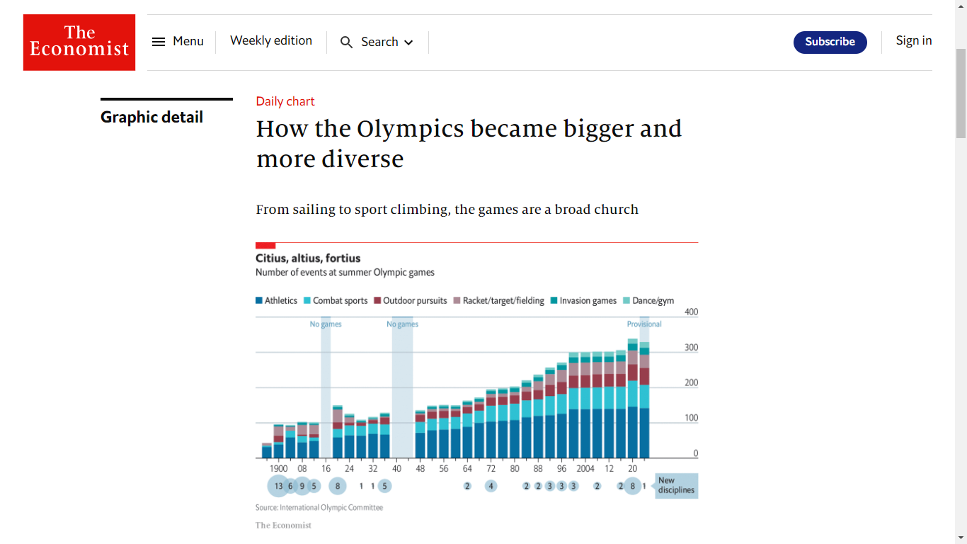
Stacked bar chart of the increase of sporting events in the Olympic Games by type, and bubble chart of the number of new disciplines. Source: https://www.economist.com/graphic-detail/2021/08/03/how-the-olympics-became-bigger-and-more-diverse
The Washington Post
Regarding the new sports at the Tokyo 2020 Olympic Games, The Washington Post produced multimedia specials on skateboarding, sport climbing, and surfing. They explain the scenarios, tricks, respective disciplines, and the evaluation criteria for the competitions. Renderings, interactive videos, and augmented reality run throughout a report on the recent Olympic athletes. We recommend trying the QR code of the climbing special to “experience” the speed climb discipline.
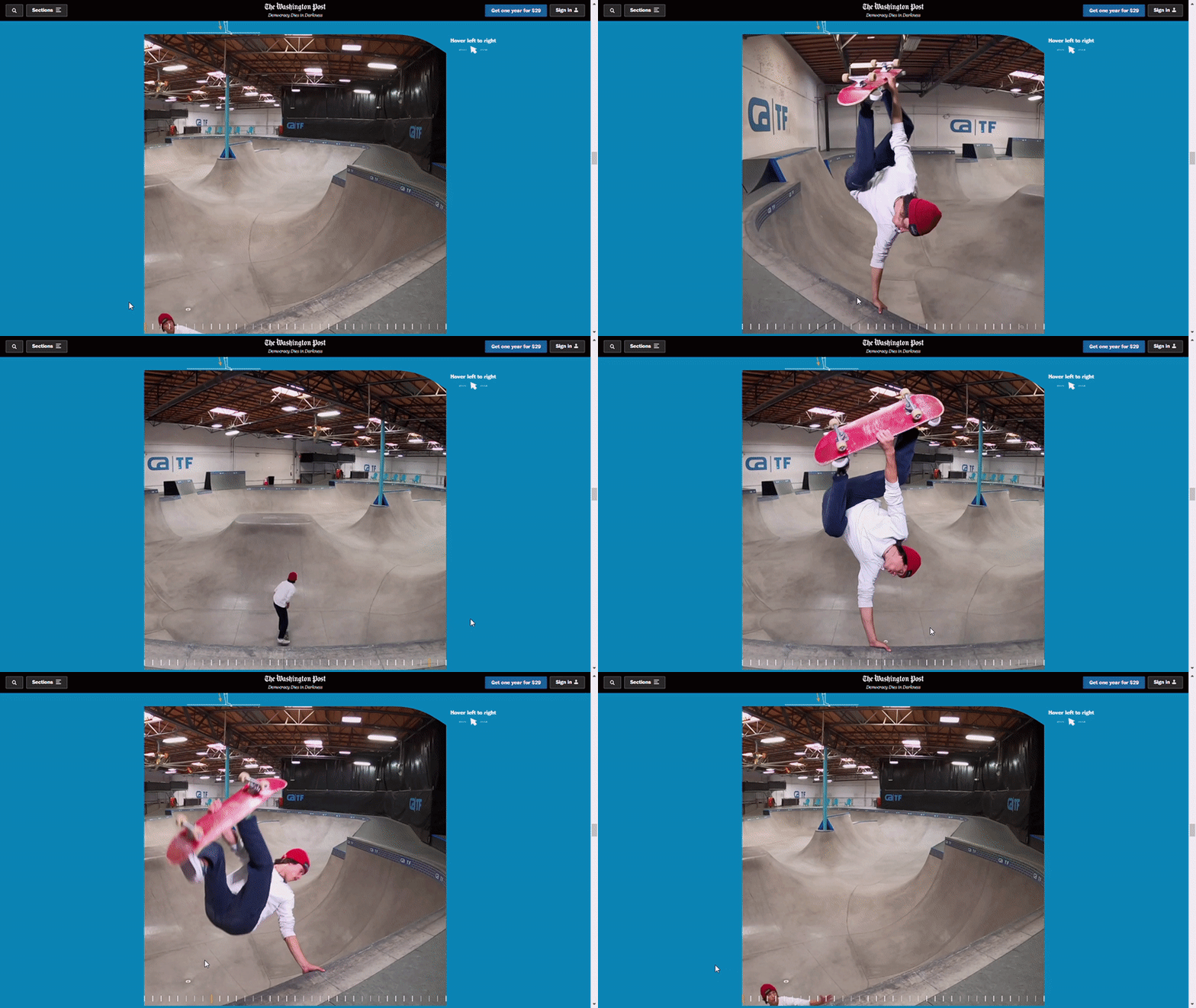
Frame visualization of a skateboarding trick (frontside invert). Source: https://www.washingtonpost.com/sports/olympics/interactive/2021/skateboarding-heimana-reynolds-gopro/
The New York Times also published a multimedia special of this type, including one on sport climbing. Both media stood out for the interactivity of their visualizations.

Interactive visualization on sport climbing. Source: https://www.nytimes.com/interactive/2021/sports/olympics/adam-ondra-climbing.html
Sky News
Sky News has emphasized the social issues surrounding the Olympic Games. For example, they analyzed the economic and public health costs of Tokyo 2020 due to the pandemic. Since countries with bigger economies win more medals, they evaluated the results according to their GDP, income, or whether they hosted Olympics. They also presented comparative visualizations of Team GB’s performance compared to previous Olympics.
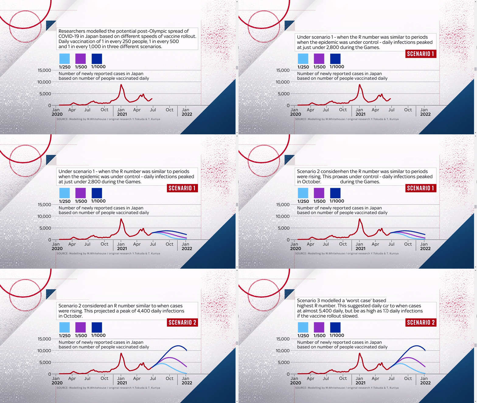
Timeline of COVID-19 transmission scenarios post-Tokyo 2020. Source: https://news.sky.com/story/tokyo-olympics-will-covid-19-cost-japan-12356445
Salesforce
Related to the above, Salesforce produced a set of visualizations about Team USA that show the number of athletes by sport, state of origin, their places of study, age and gender, height and weight, even foot size!
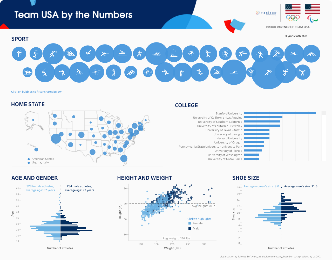
Set of visualizations about Team USA, including bubble chart and map, bar chart, population pyramid, and scatter plot. Source: https://www.salesforce.com/teamusa/#data
Flourish
Flourish offered some ideas for visualizing Tokyo 2020 data, such as race replays, countdowns, simple charts, interactive maps, medal charts, and heat maps on historical data. In the end, it presents a repository of visualizations made by its users about the recent Olympics.
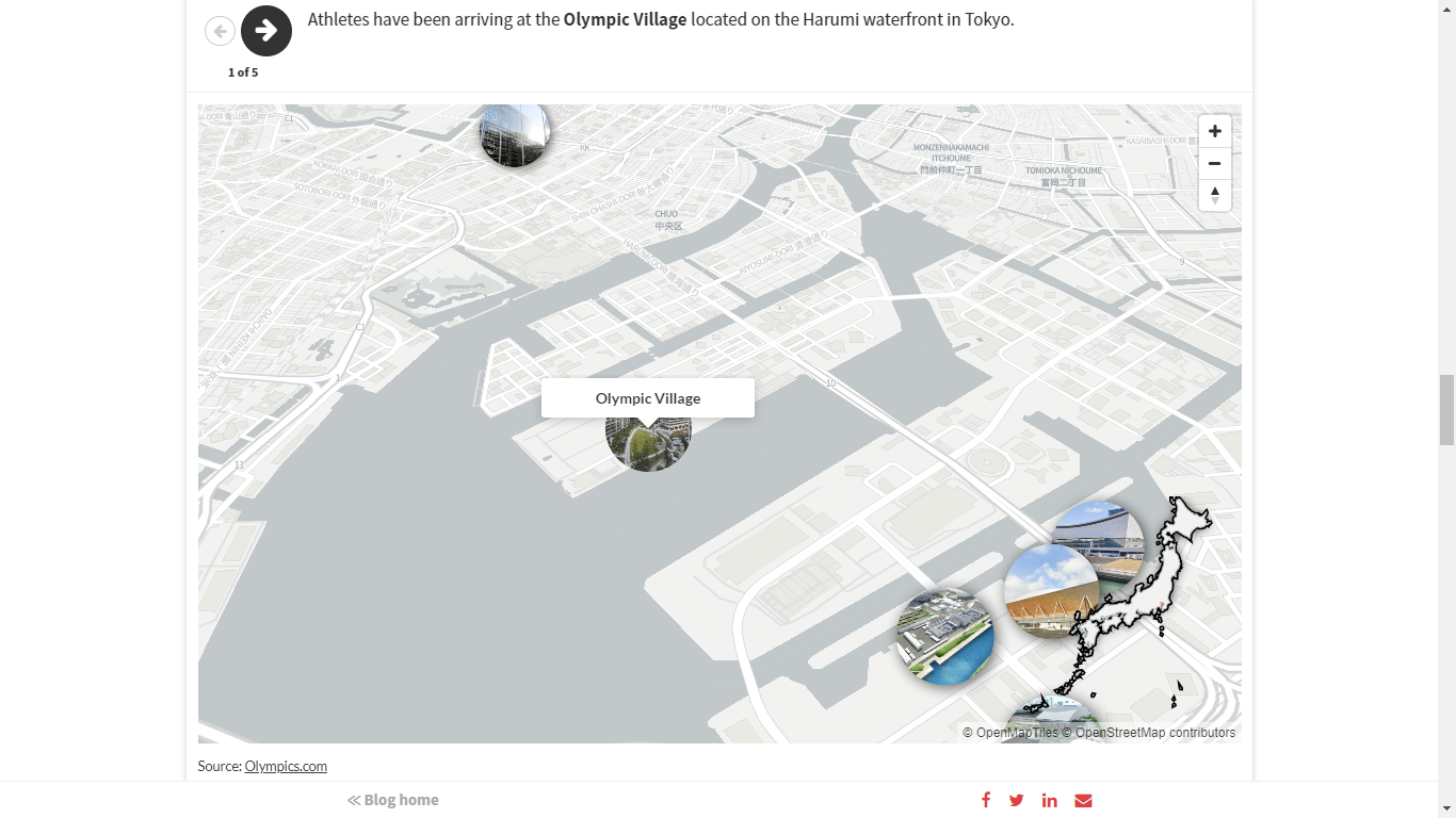
Marker map of Olympic venues. Source: https://flourish.studio/2021/07/23/olympics-tokyo-2021/
FlowingData
On the FlowingData webpage, you can access a collection of Olympic visualizations covering the period from Beijing 2008 to date, including some from the Winter Games.
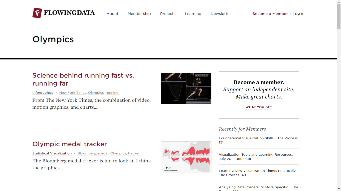
Collection of visualizations of the Olympic Games. Source: https://flowingdata.com/tag/olympics/
Data are abundant in each edition of the Olympic Games, but the visualizations about them are not far behind. Tokyo 2020 was no exception. The English-language media journalism and data visualization teams stood out for their engaging and interactive visualizations using technology applications.
If you like data visualizations and want to generate your own, we invite you to explore the tools we offer at Datasketch. Also, if you are interested in news related to data journalism, subscribe to our newsletter.


