


Data Visualization: Pie Chart
The pie chart is a pictorial representation of data that makes it possible to visualize the relationships between the parts and the whole of a variable. Learn how and when to use it.
Available in:
By Gabriel Felipe Jiménez. Published: August 18, 2021
The pie chart is a pictorial representation of data that makes it possible to visualize the relationships between the parts and the whole of a variable. For example, it is possible to understand the industry count or percentage of a variable level from the division by areas or sectors. The recommended use for pie charts is two-dimensional, as three-dimensional use can be confusing.
Like a pie chart, the total of the data that make up the segments must equal 360°, or the sum of the values of the circumference must always be 100%. To calculate the percentage of a pie chart, it is necessary to: categorize the data, calculate the total, divide the categories, convert the rates and calculate the degrees. Thus, the formula for the pie chart is:
(Data given / total value of data) x 360
The dimensions form sectors of the measurement values; they can have one or two sizes and up to two measures. The first dimension is used to define the angle of each sector that makes up the chart and the second dimension optionally determines the radius of each sector. Additionally, these plots are useful for comparing data over a fixed period since they do not show changes over time. Therefore, their use should be considered if:
- You are looking to categorize and compare a set of data.
- You only have positive values.
- You have less than seven categories since a larger number can make it difficult to perceive each segment.
Example: This graph shows how the different product lines contribute to a brand’s revenues. The visualization shows that almost half of the revenues come from the beauty line, with a higher percentage than the others, while the savings product line provides lower payments. Thus, as mentioned above, this type of visualization focuses on the relationship between the parts and the whole.

Next, we will look at the steps you need to follow to create a pie chart:
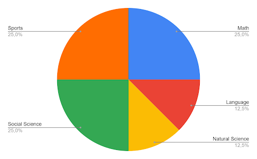
Imagine that a teacher has asked her students about the basis of their favorite classes.
| Math | Language | Natural Science | Social Science | Sports |
| 10 | 5 | 5 | 10 | 10 |
You can represent this data using a pie chart using the formula given above.
Step 1: enter the data into the table.
| Math | Language | Natural Science | Social Science | Sports |
| 10 | 5 | 5 | 10 | 10 |
Step 2: add all the values you have entered in the table to get the total.
The total number of students is 40
Step 3: Divide each value by the total and multiply by 100 to get the figure in percent.
| Maths | Language | Natural Science | Social Science | Sports |
| (10/40) x 100 =25% | (5/40) x 100 = 12,5% | (5/40) x 100 = 12,5% | (10/40) x 100 =25% | (10/40) x 100 =25% |
Step 4: to know how many degrees should be assigned to each sector of the circumference, we must take its totality which is 360°, and follow this formula:
The central angle of each component = (value of each component/sum of values of all members) x 360°.
Step 5: draw the circle and measure the degree that corresponds to each sector.
Sources:
- Statistical Discovery. (n. d.). Pie chart. Introduction to statistics | JMP. Retrieved August 3, 2021, from https://www.jmp.com/es_co/statistics-knowledge-portal/exploratory-data-analysis/pie-chart.html
- HighBond. (2021, July 21). Pie chart. https://help.highbond.com/helpdocs/highbond/es/Content/visualizations/interpretations/charts/pie_chart.html
- Pie chart - Qlik Sense SaaS Editions. (n. d.). Qlik. Retrieved August 3, 2021, from https://help.qlik.com/es-ES/cloud-services/Subsystems/Hub/Content/Sense_Hub/Visualizations/PieChart/pie-chart.htm
- General Data Protection Regulation(GDPR) Guidelines BYJU’S. (2021, March 22). BYJUS. https://byjus.com/maths/pie-chart/