Animation, Pride, and Overcrowding – Data Journalism #15
Projects in this issue cover social issues, such as overcrowding, LGBTIQ+ rights and mass shootings.
Available in:

Hi!
We are Datasketch. We want to start this issue by thanking you for being part of our community. It’s been a year since we sent out our first newsletter. We want to keep improving, so we’ve prepared a short survey to help us make a better newsletter. We promise it will take less than 5 minutes. Can you help us?
Living in a shoebox
The shortage of land for residence available in Hong Kong forces part of the population to rent tiny spaces. The South China Morning Post special shows how small can be different subdivided units to accommodate more tenants.
Illustrations, renderings, and data visualization come together to provide a graphic narrative. The text contextualizes the sections, supplementing them with data from different official surveys.

Source: Life in Hong Kong’s shoebox housing | South China Morning Post
The LGBTIQ+ Pride data
June marks more than 50 years of struggle to recognize rights for people with diverse sexual orientations and gender identities. We selected three data sources to learn about the current reality of this collective.
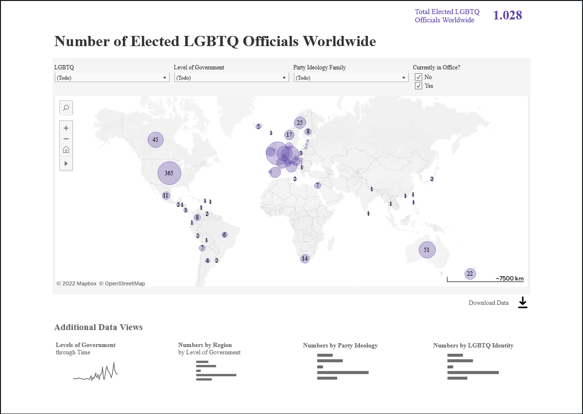
The European Union Agency for Fundamental Rights presents the state of such rights, according to the most current survey, in a viewer with different types of visualizations. The Queer Politics database provides information on LGBTQI+ people elected to public office since 1976 in the world. ILGA-Europe produces an annual index on the situation of LGBTQI+ people in 49 European countries.

Source: Queer Politics at Princeton
Dataviz
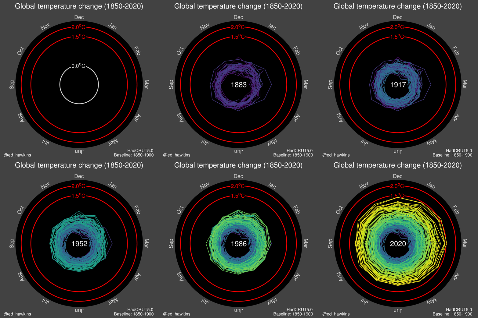
Joey Cherdachuk made an interesting compilation of examples of animated data visualizations. Some highlights are the change in the histogram of the population of China and India or the spiral visualization of the global temperature. Other cases come from data journalism, such as the animations of the competitions made by The New York Times for the Tokyo 2020 Olympic Games. The Pudding is a reference here for its innovation in presenting visualizations.

Source: Ed Hawkings | Twitter
Mass shootings
Mass shootings in schools are a topic that is back in the news. We have compiled some projects published in recent weeks, as they provide an awareness of the magnitude of the problem.
Gregor Aisch used The K-12 School Shooting Database for his visualizations on Datawrapper. The Wahington Post does its own monitoring and shows these events with a spiral visualization with dots inside bubbles representing the magnitude of the casualties.
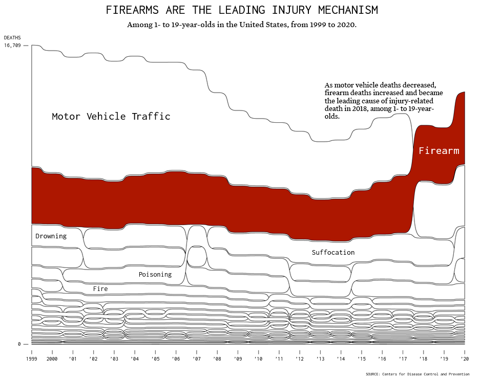
Vox visualized the correlation between the number of guns per person and gun-related incidents and the percentage of victims of underage shootings among wealthy countries. FlowingData made a flow chart of the leading causes of death in people under 20 from 1999 to 2020. FiveThirtyEight demonstrated with timelines that the favorability of stricter gun controls that emerges in the wake of shootings fades soon after.

Source: Deaths by Firearm, Compared Against Injury-Related Deaths | FlowingData.
Want to read more?
- 🎨 Data Is An Art, Not Just A Science—And Storytelling Is The Key | Shopify
- 👩🎨 Mare Hirsch – Fermilab artist-in-residence 2021-22 | Fermilab
- 🤥 Museo de la desinformación (es) | Chequeado
- 📈 One million covid deaths: Visualizing 114 lives, cut short | The Washington Post
- 🌌 Harvard Dataverse | Harvard
- 🤱 Opinion: Breastfeeding Isn’t ‘Free.’ Here’s What It Cost Me | The Washington Post
- 🥔 The war in Ukraine is fuelling a global food crisis | Reuters


