Uber Archives and Conscious Consumption - Data Journalism #16
Find out about the work and challenges of investigative journalism in the face of the Uber files revelations and data-driven projects that make our consumption conscious.
Available in:

Following the revelation of the Uber files, we talk about the work and challenges of investigative journalism. Several data-driven projects have worked on conscious consumption, so we demonstrate how data helps us to know our habits and change them. Also check out the projects, visualizations, and current events we have on the radar.
The Uber archives
The leak of Uber’s records on the company’s ties with high-level personalities and lobbying practices to dodge sanctions and modify regulations in various countries has just come to light. Mark MacGann, Uber’s former chief lobbyist for Europe, the Middle East, and Africa, leaked 18.69 gigabytes of content to The Guardian. The result is a cross-border journalistic investigation led by the International Consortium of Investigative Journalists (ICIJ) and conducted by 150 journalists from more than 40 media outlets and 29 countries, plus the ICIJ team.
The leak covered emails, text messages, and other documents from 2013 to 2017. This is challenging, requiring structuring, verification, analysis, and cross-checking of information, found in different formats, and a great deal of international coordination work.
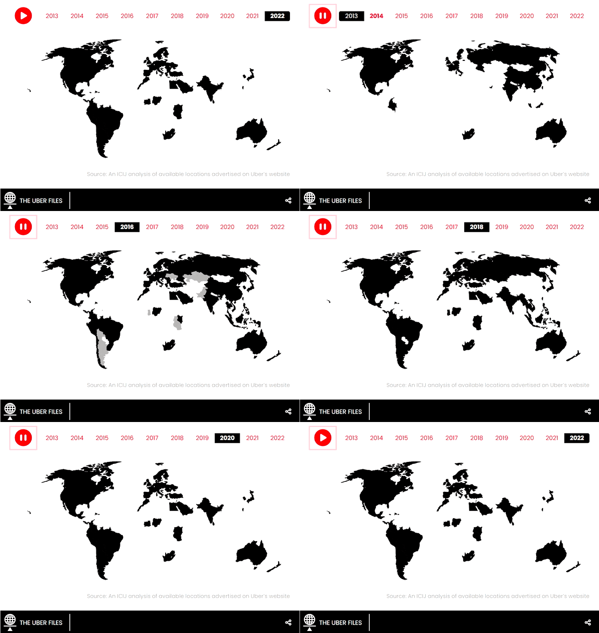
ICIJ used narrative and highlighted stories that particularly exemplified lobbying activities, measures to hinder police investigations, and increased profits and benefits from protests to the detriment of drivers. The visualizations gave the big picture of the company’s growth and identify the people who, directly or indirectly, have allowed these irregular actions to become possible, such as Emmanuel Macron or Neelie Kroes, former Vice-President of the European Commission.
This type of reporting demonstrates the relevance of investigative journalism and data analysis. Indeed, they bring to light the abuse of power by certain companies, the permissiveness of governments towards influential people, and even corruption. They also bring to the table, once again, the importance of information of public interest and the need to protect whistleblowers. As is often the case, the media have more investigative power than the public institutions in charge of this task.
ICIJ set up a mailbox to receive leaks about corruption or abuse of authority, as well as the contact of reporters to continue with far-reaching investigations such as this one.

Source: How Uber won access to world leaders, deceived investigators and exploited violence against its drivers in battle for global dominance | ICIJ.
Your consumption affects the planet. Are you aware?
The environmental impact and provenance of our food can prompt questions about our own consumption. Some of these we can answer through visualizations. We show you:
Lisa Hornung, of Inside Numbers, tired of seeing single-use plastics in all her shopping, made different visualizations of plastic use during 2021 of her and her partner. Lisa shows what she learned in this process and the considerations and limitations she had in collecting and visualizing data. Financial Times created a scale to compare two products according to their carbon footprint. The medium assumes that knowing the climate impact of food can motivate us to change our eating habits.
Erin of Data Stuff had access to U.S. agriculture data that caught her attention and decided to answer the question “What are the most prevalent crops in the country?” with it. Erin shows the results of her research and how the visualization, using the statistical programming language R, and color selection processes went. With that same data source, she later created maps of counties where there are more certain farm animals than people.
It’s a fact that we consume, but we don’t know how much, and data can give us the answer.
Dataviz
Need inspiration for your next visualization?
The Dataviz Inspiration portal features 119 eye-catching and impactful data visualization projects. Various authors have made the visualizations over the years, which address varied topics and present original yet effective ways of displaying information.
One of the projects that are not on the platform, but that we would definitely include is System, a free, open, living, public resource that aims to explain how anything in the world is related to everything else.
Projects and events on the radar
- 💸 Global inflation tracker: see how your country compares on rising prices | Financial Times 2.
- 🤒 Monkeypox 2022 global epidemiology | Global.health
- 💻 Web browsers for the last 28 years | James Eagle
- 🌍 Europe explained through data | EDJN and dataninja
- 💰🧼 Uncovering evidence of money laundering with OSINT and network visualization | Linkurious


