Data-Driven Climate Action - Data Journalism #17
Climate change data journalism projects can give us ideas for evidence-based approaches to achieving the Climate Action SDG.
Available in:

Climate change phenomena have become a recurring theme in this newsletter, a matter of concern. Heat waves are causing fires and deaths in Europe, while air pollution and the growth of cities are reducing bird habitats.
The data that the media transmits are useful for evidence-based decision-making, especially if they can be used to achieve the Sustainable Development Goal of Climate Action.
Heat waves
Heat waves and fires, increasingly recurrent and intense, have been a focus of data journalism after the start of summer in Europe. Data analysis and visualization help the media spread the scope of this problem, affecting thousands of people.
Here are five current reports that use data sources and diverse and innovative approaches to this topic:
🌡️ The Guardian took different data sources to show the picture of rising temperatures and record fires, their background, causes, and consequences.
🔥 Financial Times used data visualization to explain the severity of land cover fires, their premature onset, and higher intensity in 2022.
🌏 The Economist crossed two large temperature and population databases. In doing so, it shows that steady population growth in areas affected by extreme heat increases the number of people exposed to this phenomenon.
🥵 El País drew attention to the setback of climate action in the world due to the increased use of coal and divergent policies on the use of fossil fuels. It noted the forecast of rising temperatures with city-to-city comparisons, the consequences, and the social inequalities intensified by this phenomenon.
🧊 The Washington Post conducted the unscientific experiment of melting popsicles in the sun in several European cities to evidence temperature rise. Using everyday objects to size up the effects of this problem increases the impact of the news story and allows contextualizing other data that may otherwise go unnoticed.
Data viz: conservation of migratory routes
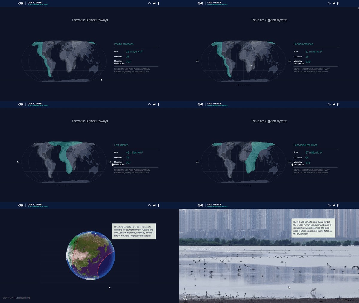
CNN created a multimedia special based on data from the Regional Flyway Initiative. This initiative of BirdLife International seeks to protect and restore the flyway through East Asia and Australasia, which is the most threatened flyway on the planet due to wetland loss.
The special’s videos, illustrations, maps, and graphics provide an overview of the flyways, their current status, population, and characterization of endemic species. Thus, it facilitates understanding the data collected by BirdLife International, other NGOs, and research centers.
This special exemplifies how data journalism can help promote, raise awareness, and give visibility to concrete actions and species conservation plans.

Source: CNN
Database: Global Energy Monitor
Global Energy Monitor brings together tools for tracking fossil fuel and energy resource projects. It provides databases, reports, and interactive tools linking public and private information sources.
The monitor allows you to study the international energy landscape. For this reason, leading international media outlets are already using it for their research, and we recommend you keep it on your radar.
The potential of the Global Energy Monitor’s resources now extends to renewable energy sources with the solar and wind energy trackers. These show the development of these types of energy at the utility-scale in each country.
News on the radar
🎙 My new podcast mini-series exploring creativity in #DataViz launched last week! | Ali Torban on Twitter
🚆 How far can you go by train in 5h? | Benjamin Td
🗄 Who owns your data? A VPN Relationship Map | Windscribe
👩🎓 Visual explanations of the basic concepts of machine learning | Machine Learning University
🧒 Why So Many Children of Immigrants Rise to the Top - The New York Times | The New York Times


