Data for Diversity and Inclusion - Data Journalism #03
In this issue, we highlight projects and initiatives that seek to build fairer societies, focusing on gender and respect for diversity through data.
Available in:
If you have reached us through social networks or have been forwarded this newsletter and would like to receive it in your email twice a month, subscribe!
This newsletter is compiled and edited by Nicolás Barahona, Juan Garnica, and Laura Tamia Ortiz. You can read the previous issues here.
#DATASKETCH
Check out some of the new posts published on our website.
Abraji Congress
The International Congress of Investigative Journalism took place between August 23 and 29. Our director, Juan Pablo Marín, participated with Maria Martha Bruno and Milagros Salazar in the “Business models in data journalism.” In Congresso Abraji (pt), you can find out all that happened at the congress.
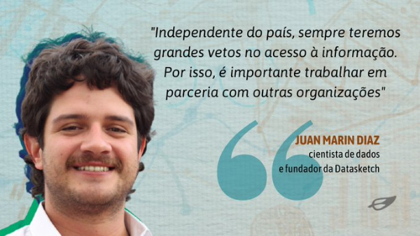
We covered two of the Congress forums. They seem of particular relevance to us because they denounce the precarious situation that many journalists suffer in the exercise of their work.
- Better Protection for Journalists Is Urgently Needed: four experts analyzed problems and proposed possible solutions to the harassment and massive digital attacks on reporters in the United States and Latin America.
- Attacks on press freedom in Asia: this panel, moderated by Márcio Gomes, from CNN Brazil, addressed the situation of journalists who have been persecuted by governments that reject freedom of the press and freedom of expression on the Asian continent, presenting experiences from Pakistan, Hong Kong, and China in general.

Types of Visualizations
Learn about different types of data visualization and how to use them.
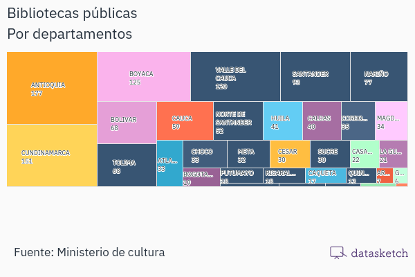
- A treemap is a type of data visualization that arranges data hierarchically. Here you can find its features, functions, recommendations, related visualizations, and entertaining examples.
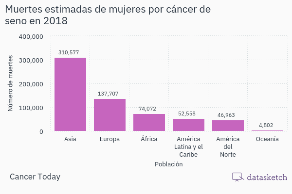
- A Bar chart is a visual representation of information used to compare and analyze data on two axes: the X-axis and the Y-axis. It allows us to see the evolution over time of a magnitude, such as the amount of food exported in the last ten years. Check https://www.datasketch.co/blog/data-visualization-bar-chart
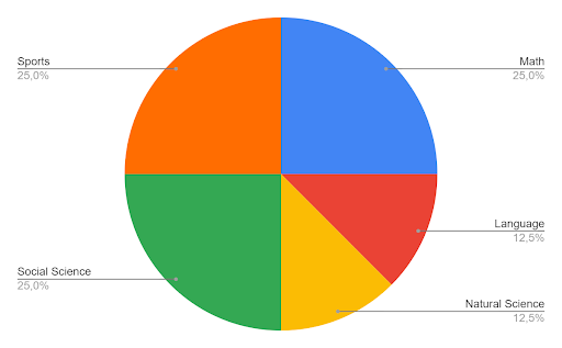
- A pie chart is a pictorial representation of data that allows you to visualize the relationships between the parts and the whole of a variable. Learn here how and when to use it.
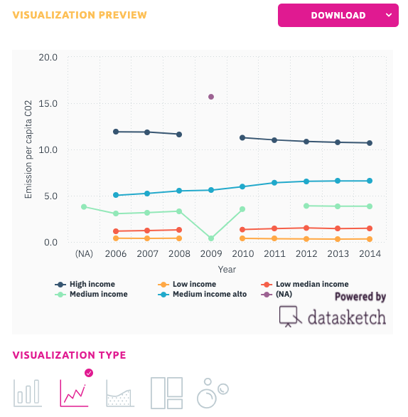
- A line chart is a graphical representation of information that changes continuously over time. Learn what it is and how to use it, its advantages and disadvantages and which of our apps you can use to create one at https://www.datasketch.co/blog/data-visualization-line-graph/
#TOOLS
Data to Address Violence Based on Sexual Orientation and Gender Identity
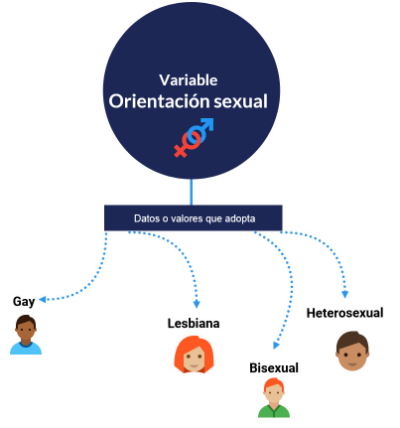
ILDA and Hivos published the Guide for data collection and analysis to address sexual orientation and gender identity violence. It is presented in course format and is designed to train civil society organizations. It explains everything from basic concepts, such as a variable or a table, to which graphs may be the easiest to use. In addition, it offers advice on how to analyze data and communicate conclusions and information. It is a simple, didactic tool that helps to provide a gender focus in research.
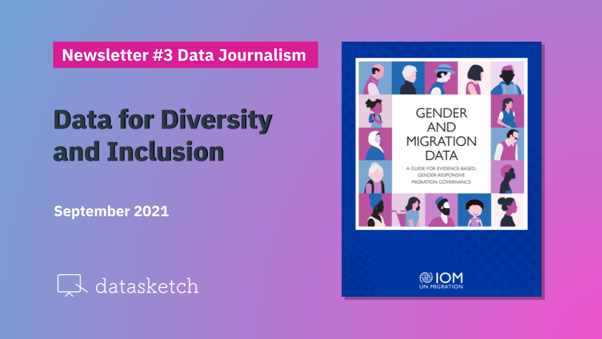
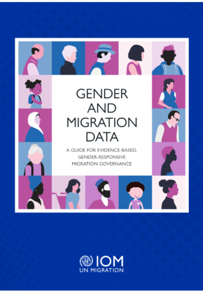
Evidence-based and gender-sensitive governance of migration.
IOM has published a guide to provide guidance to policymakers, national statistical institutes, and practitioners on why it is important to promote gender sensitivity in collecting, producing, using, analyzing, and disseminating migration data for policy, and how to do so.
Gender and diversity analysis is a useful tool for identifying needs and addressing policy gaps as part of a gender analysis framework and is also essential for practitioners who wish to communicate information in an inclusive manner, leaving no one behind.
A Guide to Reporting on Islam and Muslims
In the last few weeks, news and media worldwide have been full of reports on the complicated situation in Afghanistan, in which political, social, and religious issues are mixed. Therefore, we find this guide very useful. Unfortunately, in a moment of crisis, poor communication can have terrible consequences and promote messages of hatred.
The guide provides journalists and other media professionals with the tools to understand Islam better and write more informed, accurate, and balanced articles about Muslims. Readers can find necessary background information on Islam and Muslims, best practices for reporting, and a list of correct and appropriate terminology for covering Muslim-related issues. Guidelines on how to contact and interact with the Muslim community are also provided, along with some common misconceptions. You can read and download it here (pdf).
# AWARD
National Investigative Journalism Award
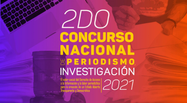
The 2nd National Contest of Investigative Journalism of Mexico seeks to motivate the participation and collaboration to prove the importance and usefulness of the right of access to public information in journalistic activity to contribute to the construction of a democratic society. The award has three categories: reportage, essay, and university investigative journalism report. The winners will receive economic retribution and recognition by INAI. The call for entries is open until September 24. Find the details at https://concurso.inai.org.mx/ensayoreportaje2021 (es)
LGBTQ+ storytelling in video games
Marianna Nash, Think with Google editor, wrote this article after the unveiling of the GLAAD Media Awards winners. She mentioned three areas to explore and improve to create inclusive video games. The possibility of generating empathy and experience from LGBTQ+ characters, instead of leaving it up to the player. 2. Positive inclusion. 3. The recognition of the community, regardless of audiences and awards. That is expected to give visibility to untold stories or that generally correspond to the character who dies.
Nash’s proposals are based on the heterogeneity of gamers. They are not just white heterosexual men between 18 and 35 years of age but diverse. To make those recommendations, she relies on data and visualizations. For example, she highlights the percentages of the gamer population identifying as LGTBQ+. She shows the bar chart on the increase in LGBTQ+ representation in video games from the 1980s to the second decade of this century.

Ten Ways to Always Be the Best
Kaiser Fung is a data visualization and business analytics expert and creator of the Junk Charts blog. From a post on the Tokyo 2020 Olympics about the multiple stories you can tell from a database, Fung corroborated with data that you can claim what works best for you depending on how you use it. First, he referenced the ten countries that led the Rio 2016 medal tally. Then, using different variables and data selections, he got each of them to be at the top of a particular ranking. So, for example, before the United States led the Tokyo 2020 medal tally by the number of gold medals won at the last moment, some media evaluated the teams by the number of total medals so that the U.S. was at the top of the list. (Check: Olympics: China, not USA, leading medal count thanks to golds).
The author highlights the importance of transparency in the methodology, primarily when pointing out the limitations. In this regard, he emphasizes that his results are based on particular facts, and may not be the case in future editions of the Olympic Games, so he warns against speculations that can be made from this type of analysis. Read the article in 10 Ways to Rank the Rio Summer Olympics.
Problems in the Way Poverty is Measured
Equality Insights found that the most significant limitations in measuring poverty come from household surveys. These ask one person to fill out a survey and respond on behalf of all cohabitants. This person is usually the “head of household” and a man.
Collecting data in this way makes an assumption - which may be erroneous - that resources are evenly distributed and that everyone living in that household has equal access to the same rights, opportunities, and resources. Thus, understanding how that mode of information collection works and transforming it is vital to driving post-pandemic development. Read the full explanation.
#Campaigns
Don't share false information!
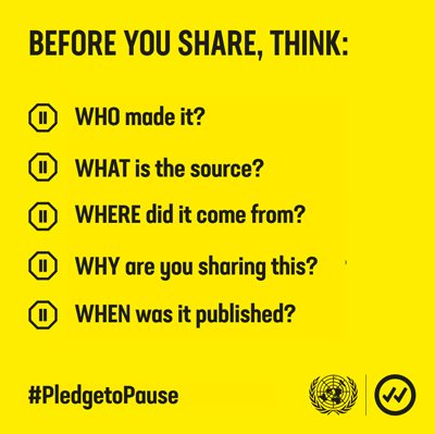
“Verified” by the UN and Purpose was launched in response to the information crisis caused by COVID, aiming to address the noise and offer verified information, advice based on facts and proven stories. Since its creation, they have launched multiple campaigns, such as #Pledgetopause, which invites you to ask yourself a series of questions before sharing information, as something so simple can have significant consequences.
As misinformation spreads, we must provide accurately and verified information, increasing the risk to health and fostering fear and division. In any crisis, such as the one we have experienced, we need access to reliable and accurate information that promotes science and real solutions, fostering solidarity within and between nations.
#Visualization
LeoLabs
To finish, something unrelated to the topics we have been dealing with in this issue has caught our attention: LeoLabs.
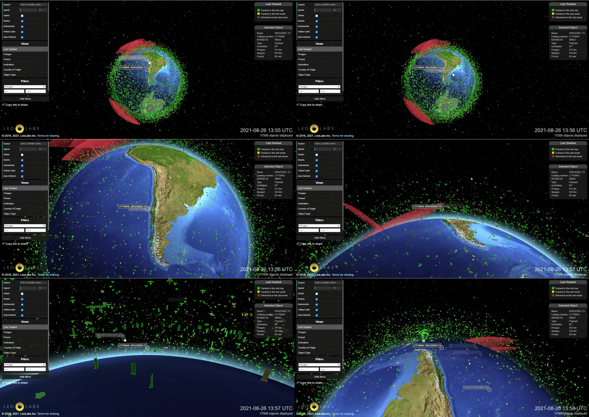
Thanks to its extensive radar network, it is a company that produces high-resolution data on objects in low Earth orbit (LEO), and it provides support to industries that rely on satellite services. What we find interesting about this project, beyond the services it offers, is that it has data visualization tools that allow monitoring of satellites, debris, and other tracked objects in low Earth orbit. A picture says more than a thousand words. Seeing the number of objects identified can make us aware of our impact, not only on Earth but also in space. It can awaken a person’s interest in a subject that sometimes is not so close or help a journalist understand the information correctly before communicating about it.
That's all for now!
We hope our selection of news has been of interest to you. If you have any content recommendations or a topic of interest, please reply to this email and let us know how we can improve.
If someone sent you this email because they think you might be interested and want to receive this newsletter twice a month, you can do it here!
We have other newsletters:


