Life-saving Graphics, Manuals and Sentences - Data Journalism #01
Datasketch Newsletter Data Journalism #1
Available in:
Welcome to Data Journalism
This newsletter is compiled and edited by Datasketch’s Data Journalism team, composed by Sasha Muñoz-Vergara, Juliana Galvis, Laura Ortiz, Juan Pablo Marín Díaz. In it, you will find the latest trends in data journalism, information about events, and tools that we believe can be useful for your journalistic work, including links and a summary of the information.
#DATASKETCH
In our blog, we have started to publish a series of articles related to journalism and data visualization. We analyze articles by other authors and recommend tools that can be useful in journalistic work, so we would like to invite you to read:
- Deep fake and other threats against the truth: Do you know what a deep fake is? This technology, which can be fun, carries risks that we will analyze in this article.
- Tools for converting files to open and reusable format: Here are 6 tools for converting closed files into open data that you can use for your visualizations.
- How is an algorithmic bias composed?: Algorithms and codes developed by humans, but how do they really work? Why do they get it wrong? Find out in this article.
#TOOLS
New Data Journalism Handbook
The European Journalism Center and Google News Initiative have published The Data Journalism Handbook: Towards a Critical Data Practice. This new publication has eight chapters covering everything from organizing large databases, algorithms, and strategies for creating independent media. This handbook is the second part of a first publication, The Data Journalism Handbook: How Journalists Can Use Data to Improve the News (O’Reilly Media, 2012). “The pandemic has heightened awareness of not only using but also critically reporting numbers and data,” reads the introduction to this guide.
You can access the manual here.
In the previous edition of the Data Journalism Handbook, you can find an analysis of our research on Trees of Bogota, more than one million trees of Bogota analyzed. Check it out here.
#PODCAST
Covid-19 special episode on The Data Journalism Podcast
Google News Lab’s current Data Journalist & Data Editor, Simon Rogers, and Alberto Cairo, Professor of Visual Journalism at the University of Miami (UM) School of Communication, launched a special on their podcast about Covid-19 coverage of data journalism. This time, they go into the world of journalists' social responsibility regarding global vaccination, the follow-up projects of different recognized media, and especially about what can happen if journalists do not provide correct information about the number of cases and vaccines. This podcast is 50 minutes long and you can listen to it here.
Also, if you are interested in vaccination information, we invite you to read our article on the recommendations given by the Open Government Partnership (OGP) to governments to achieve open and transparent vaccination processes: 21 OGP recommendations for open vaccination.
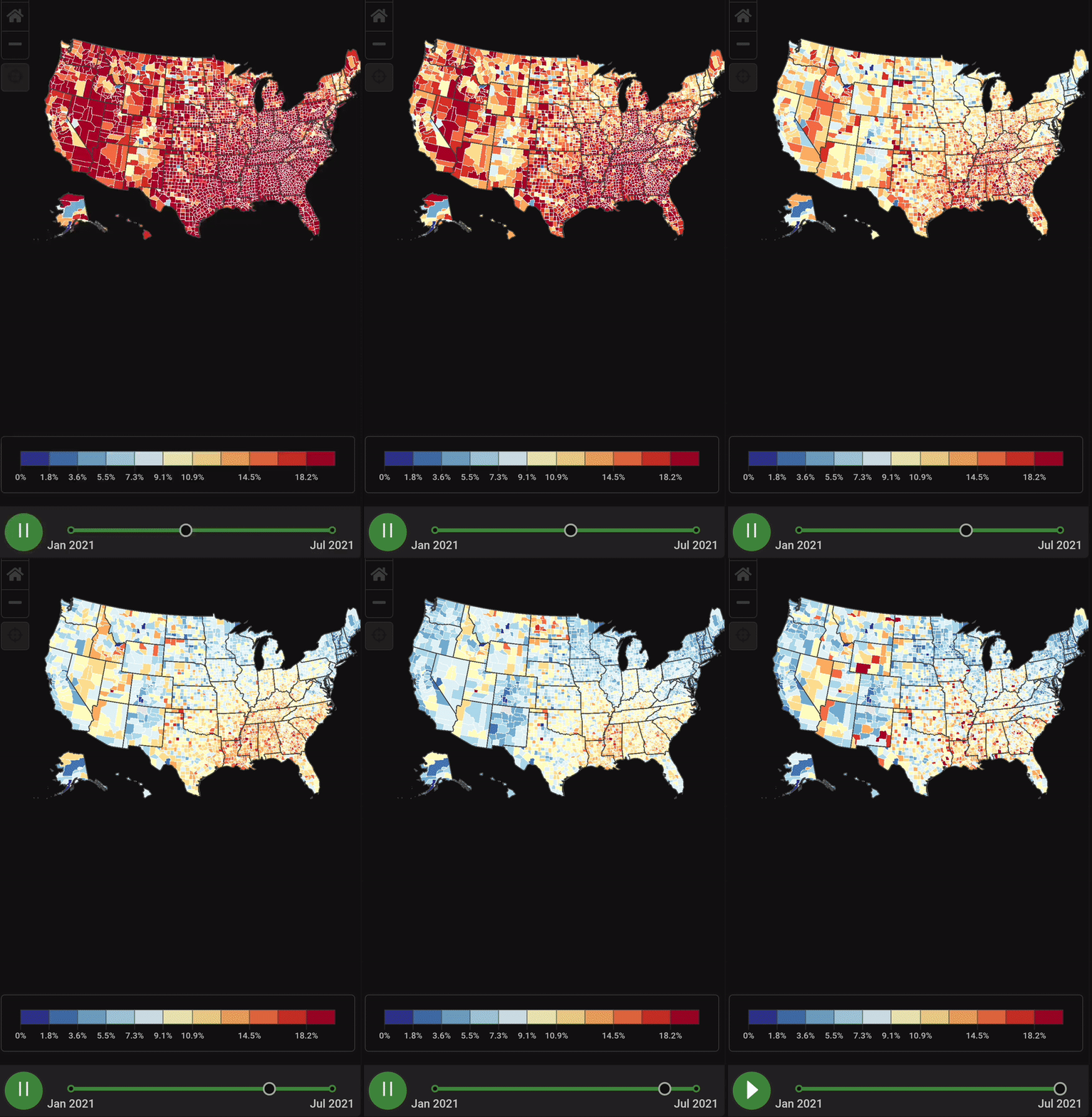
In this graph from Health Data, you can see how the level of US citizens' doubts about vaccines has evolved in recent months.

By http://www.healthdata.org/results/data-visualizations
#ARTICLES
An historical account of data visualization
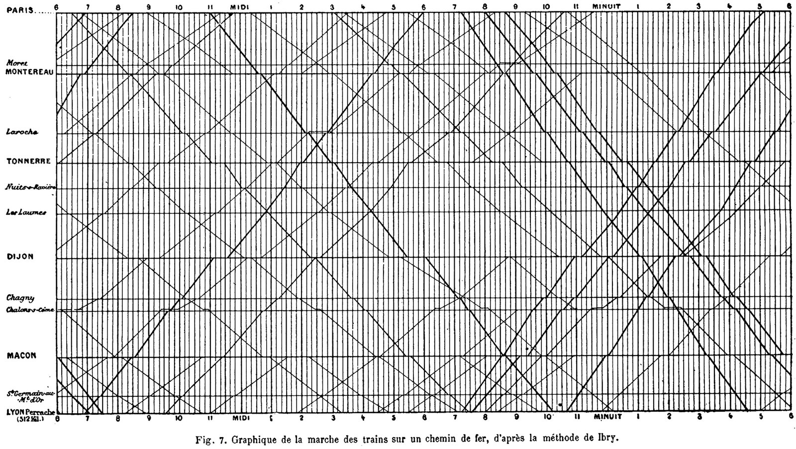
The New Yorker published Hanna Fry’s When Graphs Are a Matter of Life and Death article on data visualization, which has emerged as a means of making things manageable and understandable on a day-to-day basis. The article is a historical account of some of the most important milestones in the field.
Patterns continue to emerge and drive our understanding of the world, even though they are no longer visible to the human eye. But these modern innovations only exist because of the original idea that it was possible to think about numbers visually. These tools change how we see things and what exactly we see. We invite you to read our review of the article: Recommended article: When graphics are a matter of life and death.

1878 chart shows each train between Paris and Leon in a 24-hour period, by Charles Ibry. Taken from The New Yorker.
Today, we can find innovations such as the Coronavirus Live Streaming: a World Map and live count of total cases, deaths, recoveries, and vaccination progress by country.
#REGULATIONS
US Supreme Court Ruling Is a Triumph for Investigative Journalists and Civil Rights Investigators
The US Supreme Court has decided to interpret the Computer Fraud and Abuse Act (CFAA), a federal anti-hacking law from the 1980s. The ruling may benefit journalists and researchers, as it creates a precedent that could facilitate their access to data platforms without their work being considered a violation - with corresponding criminal or civil liability - of the authorized access that websites unilaterally, and sometimes abusively, allow in their legal terms and conditions, which most users do not even read and which restrict, for example, the use of web scraping, to access their information. Supreme Court Ruling is a Win for Investigative Journalists and Civil Rights Researchers.
A case related to web scraping was in 2012 when the social network LinkedIn was hacked by Russian cybercriminals, who stole the passwords of almost 6.5 million user accounts.
#MAPS
ODI Registry of Data Institutions
The Open Data Institute (ODI) has published its registry of Data Institutions - organizations whose purpose is to manage data on behalf of others, often for the public, educational or charitable purposes. The registry is a living, curated repository of data institutions from around the world. They are looking for this tool systematically to document data institutions as they learn about them, sample data institutions for further analysis in their research projects, or discover interesting examples for talks and other promotional activities.
We also share with you this project that we implemented for the Latin American Initiative for Open Data (ILDA), called Explora LATAM, a website of data organizations working in Latin America.
#EVENTS
Democratising Data
At the European Journalism Center and News Impact Summit’s “Democratising data: Making data a tool of effective journalism,” an event held June 15 virtually, discussed how data visualization goes beyond numbers and ends up affecting public debate and democracy, how new user interfaces and data collection technologies are contributing to greater public understanding of the news. Also, issues related to public trust in artificial intelligence and deep data were touched upon.
And, for the German elections in September and the French elections next year, what lessons have been learned from the U.S. 2020 elections to avoid the massive dissemination of distorted data?
Watch the live transmision here.
#VISUALIZATION
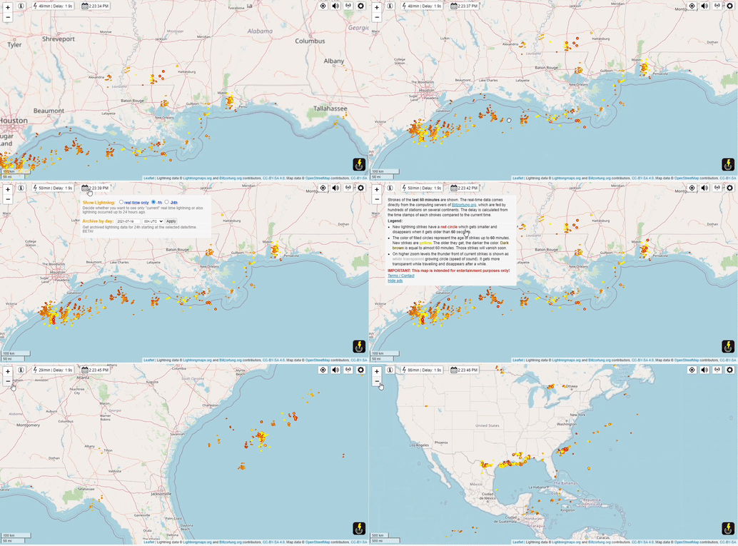
To finish, we leave you a curious visualization. Real-Time Lightning Map from LightningMaps.org is part of the “Blitzortung.org” project and works as a lightning detection network to locate electromagnetic discharges in the atmosphere. It consists of a community of station operators who send their data to computer servers, programmers who develop and/or implement algorithms for locating and displaying spherical positions, and people who help in any way to keep the system running. The network has more than 500 lightning receivers and some central processing servers, which makes it possible to see in real-time lightning strikes at all times.

That's all for now
If you don’t remember me or don’t remember Datasketch, we have your email directly in our contact list, and we think this topic may be relevant for you. Here I tell you how I organized the whole database of contacts to send you this email. Maybe you will find relevant tips for your own work. Also, if you want to read the previous newsletters, you will find them at Datasketch Newsletter - Data Journalism.
If someone sent you this email because they think you might be interested and want to subscribe, you could do it here, subscribe!
We have other newsletters:


